
Article Categories
- All Categories
-
 Data Structure
-
 Networking
-
 RDBMS
RDBMS
-
 Operating System
-
 Java
Java
-
 MS Excel
-
 iOS
iOS
-
 HTML
HTML
-
 CSS
CSS
-
 Android
-
 Python
-
 C Programming
-
 C++
C++
-
 C#
C#
-
 MongoDB
-
 MySQL
MySQL
-
 Javascript
-
 PHP
PHP
-
 Economics & Finance
How to reduce the space between Y-axis value and ticks using ggplot2 in R?
To reduce the space between axis value and ticks using ggplot2, we can use theme function of ggplot2 package with margin set to 0.
For example, if we have a data frame called df that contains two columns say x and y then the scatterplot between x and y with reduced space between Y-axis value and ticks can be created by using the following command −
ggplot(df,aes(x,y))+geom_point()+theme(axis.text.y=element_text(margin=margin(r=0)))
Example
Following snippet creates a sample data frame −
x<-rnorm(20)
y<-rnorm(20)
df<-data.frame(x,y)
df
The following dataframe is created −
        x            y
1   1.05651189  1.62466604
2   0.75126625  0.10865331
3  -0.30352094  1.07921449
4   0.70523243  1.74960704
5   1.28391425  0.19250488
6   0.03709786  0.73768877
7   2.34875021 -0.32218372
8  -0.22407923  1.88224542
9  -0.98285155 -0.25604636
10 -0.03147729 -0.07521586
11 -1.14026845  1.08064902
12  0.47178944 -1.05470149
13 -0.52618206  0.06314217
14 -1.06858841  0.08250274
15  0.94736152 -0.61196038
16 -0.59843417  0.32012878
17 -0.25745760  0.01081559
18 -0.84851784  1.26741818
19  0.96683173  0.66261988
20  0.73711373  0.22668931
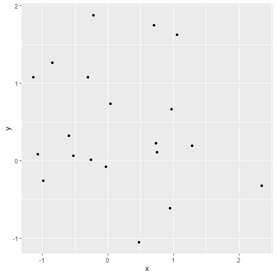
To load ggplot2 package and create point chart between x and y, add the following code to the above snippet −
library(ggplot2)
ggplot(df,aes(x,y))+geom_point()
Output
If you execute all the above given snippets as a single program, it generates the following output −
To create point chart between x and y with reduced space between Y-axis value and ticks, add the following code to the above snippet −
ggplot(df,aes(x,y))+geom_point()+theme(axis.text.y=element_text(margin=margin(r=0)))
Output
If you execute all the above given snippets as a single program, it generates the following output −


5K+ Views
