
 Data Structure
 Networking
 RDBMS
RDBMS Operating System
 Java
Java MS Excel
 iOS
iOS HTML
HTML CSS
CSS Android
 Python
 C Programming
 C++
C++ C#
C# MongoDB
 MySQL
MySQL Javascript
 PHP
PHP
- Selected Reading
- UPSC IAS Exams Notes
- Developer's Best Practices
- Questions and Answers
- Effective Resume Writing
- HR Interview Questions
- Computer Glossary
- Who is Who
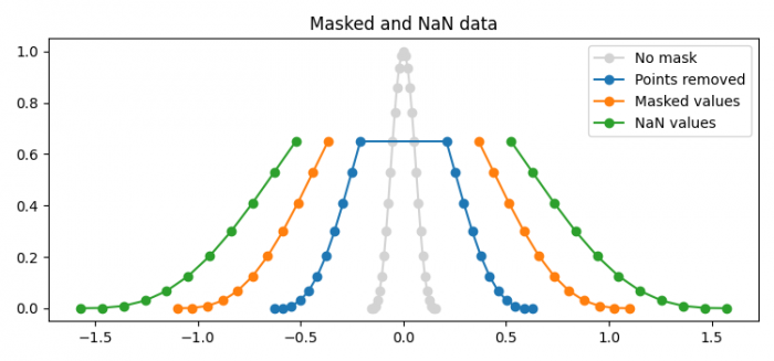
How to plot masked and NaN values in Matplotlib?
To plot masked and NaN values in Matplotlib, we can take the following steps −
- Set the figure size and adjust the padding between and around the subplots.
- Create x and y data points using numpy.
- Get x2 and y2 data points such that y > 0.7.
- Get masked y3 data points such that y > 0.7.
- Mask y3 with NaN values.
- Plot x, y, y2, y3 and y4 using plot() method.
- Place a legend to the plot.
- Set the title of the plot.
- To display the figure, use show() method.
Example
import matplotlib.pyplot as plt
import numpy as np

plt.rcParams["figure.figsize"] = [7.50, 3.50]
plt.rcParams["figure.autolayout"] = True

x = np.linspace(-np.pi/2, np.pi/2, 31)
y = np.cos(x)**3

# 1) remove points where y > 0.7
x2 = x[y <= 0.7]
y2 = y[y <= 0.7]

# 2) mask points where y > 0.7
y3 = np.ma.masked_where(y > 0.7, y)

# 3) set to NaN where y > 0.7
y4 = y.copy()
y4[y3 > 0.7] = np.nan

plt.plot(x*0.1, y, 'o-', color='lightgrey', label='No mask')
plt.plot(x2*0.4, y2, 'o-', label='Points removed')
plt.plot(x*0.7, y3, 'o-', label='Masked values')
plt.plot(x*1.0, y4, 'o-', label='NaN values')
plt.legend()

plt.title('Masked and NaN data')

plt.show()
Output

Updated on: 2021-06-10T12:15:39+05:30
4K+ Views

Advertisements