
 Data Structure
 Networking
 RDBMS
RDBMS Operating System
 Java
Java MS Excel
 iOS
iOS HTML
HTML CSS
CSS Android
 Python
 C Programming
 C++
C++ C#
C# MongoDB
 MySQL
MySQL Javascript
 PHP
PHP
- Selected Reading
- UPSC IAS Exams Notes
- Developer's Best Practices
- Questions and Answers
- Effective Resume Writing
- HR Interview Questions
- Computer Glossary
- Who is Who
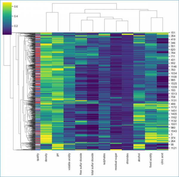
How to Plot Cluster using Clustermaps class in Matplotlib
Let us suppose you have given a dataset with various variables and data points thus in order to plot the cluster map for the given data points we can use Clustermaps class.
In this example, we will import the wine quality dataset from the https://archive.ics.uci.edu/ml/datasets/wine+quality.
import matplotlib.pyplot as plt
import numpy as np
import seaborn as sns
sns.set(style='white')

#Import the dataset
wine_quality = pd.read_csv(‘winequality-red.csv’ delimeter=‘;’)
Let us suppose we have raw data of wine Quality datasets and associated correlation matrix data.
Now let us plot the clustermap of the data,
row_colors = wine_quality["quality"].map(dict(zip(wine_quality["quality"].unique(),"rbg")))
g = sns.clustermap(wine_quality.drop('quality',axis=1),standard_scale=1, robust=True,row_colors=row_colors, cmap='viridis')
Plot the clustermap of the following datasets,
g = sns.clustermap(corr, figsize=(10,8), z_score=1, cbar_kws={"label":"color bar"})
Output

Updated on: 2021-02-23T19:45:42+05:30
318 Views

Advertisements