
 Data Structure
 Networking
 RDBMS
RDBMS Operating System
 Java
Java MS Excel
 iOS
iOS HTML
HTML CSS
CSS Android
 Python
 C Programming
 C++
C++ C#
C# MongoDB
 MySQL
MySQL Javascript
 PHP
PHP
- Selected Reading
- UPSC IAS Exams Notes
- Developer's Best Practices
- Questions and Answers
- Effective Resume Writing
- HR Interview Questions
- Computer Glossary
- Who is Who
How to plot aggregated by date pandas dataframe?
To plot aggregated by date pandas dataframe, we can take the following steps −
Steps
Set the figure size and adjust the padding between and around the subplots.
Create a data frame, df, of two-dimensional, size-mutable, potentially heterogeneous tabular data.
Get the values of aggregated by date pandas dataframe.
Plot the df (Step 3) with kind="bar".
To display the figure, use show() method.
Example
import numpy as np
import pandas as pd
from matplotlib import pyplot as plt, dates

# Set the figure size
plt.rcParams["figure.figsize"] = [7.50, 3.50]
plt.rcParams["figure.autolayout"] = True

# Create a dataframe
df = pd.DataFrame(dict(data=list(pd.date_range("2021-01-01", periods=10)),
value=np.linspace(1, 10, 10)))
df = df.groupby('data').agg(['sum']).reset_index()

# Plot the dataframe
df.plot(x='data', y='value', kind="bar")

# Display the plot
plt.show()
Output
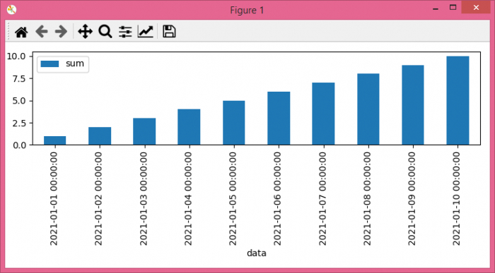
It will produce the following ouput −

Updated on: 2022-02-02T10:01:27+05:30
1K+ Views

Advertisements