
 Data Structure
 Networking
 RDBMS
RDBMS Operating System
 Java
Java MS Excel
 iOS
iOS HTML
HTML CSS
CSS Android
 Python
 C Programming
 C++
C++ C#
C# MongoDB
 MySQL
MySQL Javascript
 PHP
PHP
- Selected Reading
- UPSC IAS Exams Notes
- Developer's Best Practices
- Questions and Answers
- Effective Resume Writing
- HR Interview Questions
- Computer Glossary
- Who is Who
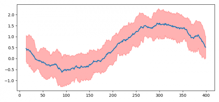
How to plot a time series array, with confidence intervals displayed in Python? (Matplotlib)
To plot a time series array, with confidence intervals displayed in Python, we can take the following steps −
- Set the figure size and adjust the padding between and around the subplots.
- Get the time series array.
- Initialize a variable, n_steps, to get the mean and standard deviation.
- Get the under and above lines for confidence intervals.
- Plot the mean line using plot() method.
- Use fill_between() method to get the confidence interval.
- To display the figure, use show() method.
Example
import numpy as np
import pandas as pd
import matplotlib.pyplot as plt

plt.rcParams["figure.figsize"] = [7.50, 3.50]
plt.rcParams["figure.autolayout"] = True

time_series_array = np.sin(np.linspace
                           (-np.pi, np.pi, 400)) + np.random.rand((400))
n_steps = 15

time_series_df = pd.DataFrame(time_series_array)

line = time_series_df.rolling(n_steps).mean()

line_deviation = 2 * time_series_df.rolling(n_steps).std()

under_line = (line - line_deviation)[0]

over_line = (line + line_deviation)[0]

plt.plot(line, linewidth=2)

plt.fill_between(line_deviation.index, under_line,
                  over_line, color='red', alpha=.3)

plt.show()
Output

Updated on: 2021-06-17T12:00:25+05:30
3K+ Views

Advertisements