
Article Categories
- All Categories
-
 Data Structure
-
 Networking
-
 RDBMS
RDBMS
-
 Operating System
-
 Java
Java
-
 MS Excel
-
 iOS
iOS
-
 HTML
HTML
-
 CSS
CSS
-
 Android
-
 Python
-
 C Programming
-
 C++
C++
-
 C#
C#
-
 MongoDB
-
 MySQL
MySQL
-
 Javascript
-
 PHP
PHP
Selected Reading
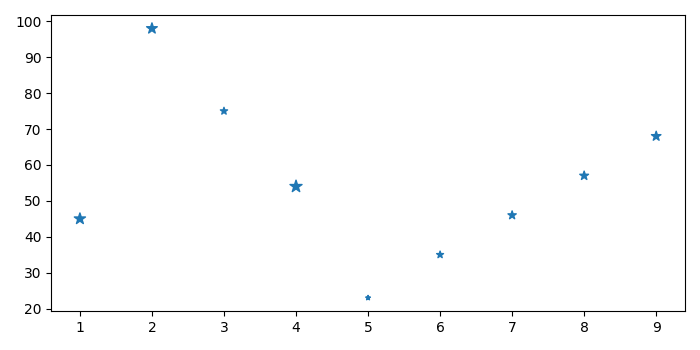
How to modify a 2d Scatterplot to display color based on a third array in a CSV file?
To modify a 2d scatterplot to display color based on a third array in a CSV file, we can take the following steps −
- Set the figure size and adjust the padding between and around the subplots.
- Read the CSV file with three headers.
- Create a new figure or activate an existing figure.
- Add an 'ax' to the figure as part of a subplot arrangement.
- Make a scatter plot with CSV file data points.
- To display the figure, use show() method.
Example
import pandas as pd
from matplotlib import pyplot as plt

plt.rcParams["figure.figsize"] = [7.00, 3.50]
plt.rcParams["figure.autolayout"] = True

columns = ["data1", "data2", "data3"]
df = pd.read_csv("input.csv", usecols=columns)

fig = plt.figure()
ax = fig.add_subplot(111)
ax.scatter(df.data1, df.data2, df.data3, marker="*")

plt.show()
The "input.csv" file contains the following data
| data1 | data2 | data3 |
|---|---|---|
| 1 | 45 | 71 |
| 2 | 98 | 65 |
| 3 | 75 | 29 |
| 4 | 54 | 63 |
| 5 | 23 | 12 |
| 6 | 35 | 27 |
| 7 | 46 | 39 |
| 8 | 57 | 44 |
| 9 | 68 | 51 |
Output
When we run the code, it will produce the following scatter plot


Updated on: 2021-09-22T08:47:24+05:30
363 Views

Advertisements