
 Data Structure
 Networking
 RDBMS
RDBMS Operating System
 Java
Java MS Excel
 iOS
iOS HTML
HTML CSS
CSS Android
 Python
 C Programming
 C++
C++ C#
C# MongoDB
 MySQL
MySQL Javascript
 PHP
PHP
- Selected Reading
- UPSC IAS Exams Notes
- Developer's Best Practices
- Questions and Answers
- Effective Resume Writing
- HR Interview Questions
- Computer Glossary
- Who is Who
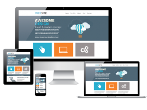
How to Make Your WebSite – “Device Friendly”
Do you know that more than half of the world’s population is currently using internet on a regular basis through various devices? It can be a laptop, desktop, Smartphone or any other gadget. Just imagine the tremendous opportunity you have for reaching your potential customers just by doing business online. It is the easiest and quickest medium to reach to the people and let them know about your products and services. You can make hundreds and thousands of actual customers out of them, provided your e-commerce site offers superb user experiences across the various devices.
Let’s say you have a built a nice website and started selling online. But, is your website capable of providing smooth services to your customers across the entire medium? Are they experiencing comfortable shopping experience while exploring your site? Is the checkout process is smooth enough that they can easily make payments to buy the products using any device?
Well, your site may be working fine on laptops/desktops, but what about the other devices? It may work great on the big screen devices, but what about the Smartphone, iPad, Tablet etc.? Your customers are free to use any of such devices for online shopping; they are not restricted to only laptops /desktops, isn’t it?.
So, the big question is, are you ready to provide a smooth shopping experience to your customers irrespective of the devices they use to shop online?.
Don’t worry! We will discuss all these important aspects of your e-commerce site to make it hassle free for your customers.
Let’s discuss various important sections of your website along with the clues to find out the critical areas which require proper optimization to improve the shopping experience of your customers.
Check Out The Navigation Flow
Let’s start from your home page. That’s your drawing room, through which a person can visit each room. It contains links to various individual products’ pages from where a person can choose and proceed to buy the products. But, what will happen if the passage to the individual room is blocked? How can the user purchase the product?
So, it is important to check the navigation flows of each page from the home page and vice-versa. And more importantly, it should work across the various devices. It may be worked on one device but falling on other. That’s a big issue, after all, if your customer can’t complete a full cycle of transactions then how can they purchase your products.
But, how do you know that there are some issues with the navigation flows?

For example, you are selling toys online. You have built a nice website with lots of images and videos of beautiful toys. One day, you pulled up the analytics reports to check your site’s online performance. You have noticed that a good number of people have landed on your home page but didn’t view any other pages. They have not even visited a single individual product page out of the hundred awesome products pages you have. Also an interesting thing you noticed that, all those users explored your site through various mobile devices.
There may be two reasons behind that, first, your products are not good enough that deserves at least a look and second, the users are having difficulties in navigating to other pages. I am completely rejecting the first reason, as you are already selling your items, your products may not be so bad! So, it is the second reason that restricting the users to becoming your actual customers.
So, it is the time to check the navigation flows of your site, especially on Smartphone. Your site may be working great on laptops/desktops, but not performing well on mobile devices can lose major portions of potential earning revenue.
Optimize the Checkout Process
Another important part is the checkout process. After all, it is all about money, the customers give you the money in exchange for the products they want. But, if that process is not smooth enough then they may reject your site and tag it as an unstable site, isn’t it?.
Let’s assume that you are selling designer ornaments online through a nicely built website. You have showcased many images and videos of unique ornaments. The eye-catching designs have the potential to get maximum attention from the customers.
After few days, you looked at your analytics data to judge the performances. The data shows that you are getting good numbers of page views. A good number of people looking at the various jewelry designs, but was not generating enough sales. Even many of the users saved few products on their shopping cart, but things are not moving beyond that.

You wonder why those people are not converting to your real customers. Looking at the analytics data you noticed that most of the users visited your site using their mobile devices, but they seldom make a purchase.
That’s the clue to catch the culprit. That indicates that the customers are facing issues while attempting to purchase on your site through their mobiles. You have to work on your site, especially the checkout process to make it more mobile friendly.
There is other such important information that you can get by analyzing you web analytics data to know where your site is lacking. And based on your analysis you can make the necessary optimization to make your site runs perfectly on your target devices.
Which Device to Focus On
Your potential customers are not limited to any particular device for exploring your site. There are multiple numbers of devices in the market on which they can browse your site and make purchases. So, it is important to make your site robust across the various devices.
But, is it reasonable to test your site on various devices where new gadgets keep on releasing day by day? Then how can you decide which devices you should focus?

The analytics data of your site can provide you the correct answer. Yes, looking at your analytics data, you can know the devices from which your site is getting the maximum number of traffics. And, based on your analysis you can do the necessary improvements. Although, many studies says that these days maximum number of people are using mobiles for their online activities.
Apart from these, you should also take care of the quality part according to the devices that generating highest traffics. If there are maximum numbers of mobile users for your site, then check the quality of the pictures, videos, texts fonts, and colors for the small screen.
Finally, you can think about responsive design which can easily adapt different screen sizes. Also, if you are getting enough visitors through mobile devices, then you may think to create a dedicated exclusive site only for your mobile users. After all, it is wiser to expend some small amount today, which in turn returns you a lot in future.

251 Views
