
Article Categories
- All Categories
-
 Data Structure
-
 Networking
-
 RDBMS
RDBMS
-
 Operating System
-
 Java
Java
-
 MS Excel
-
 iOS
iOS
-
 HTML
HTML
-
 CSS
CSS
-
 Android
-
 Python
-
 C Programming
-
 C++
C++
-
 C#
C#
-
 MongoDB
-
 MySQL
MySQL
-
 Javascript
-
 PHP
PHP
How to highlight all the values from a group on hover in Python Plotly?
Plotly has features to group data values. You can also highlight all the values from a group on hover. In this tutorial, we will use plotly.io to generate the figures. It contains a lot of methods to customize the charts.
Follow the steps given below to highlight all the values from a group on hover.
Step 1
Import the plotly.io module and alias as pio.
import plotly.io as pio
Step 2
Create a list of values to form a dictionary.
fonts = ['Arial', 'Arial', 'Courier', 'Arial', 'Courier', 'Arial']
shade = ['bold','bold','italic','italic','bold','bold']
score = [1,2,3,4,5,6]
Step 3
Create a scatter plot based on X and Y-axis coordinate values and apply groupby for fonts and set styles for the dictionary of values.
data = [dict(
   type = 'scatter',
   x = shade,
   y = score,
   mode = 'markers',
   transforms = [dict(
      type = 'groupby',
      groups = fonts,
      styles = [
         dict(target = 'Arial', value = dict(marker = dict(color = 'blue'))),
         dict(target = 'Courier', value = dict(marker =
         dict(color = 'red'))),
         dict(target = 'bold', value = dict(marker = dict(color = 'black'))),
         dict(target = 'italic', value = dict(marker =
         dict(color = 'green')))
      ]
   )]
)]
Step 4
Let us generate the figure with dictionary of values and plot the graph. It is defined below,
fig_dict = dict(data=data)
pio.show(fig_dict, validate=False)
Example
Here is the complete code to highlight all the values from a group on hover ?
import plotly.io as pio

fonts = ['Arial', 'Arial', 'Courier', 'Arial', 'Courier', 'Arial']
shade = ['bold','bold','italic','italic','bold','bold']
score = [1,2,3,4,5,6]

data = [dict(
   type = 'scatter',
   x = shade,
   y = score,
   mode = 'markers',
   transforms = [dict(
      type = 'groupby',
      groups = fonts,
      styles = [
         dict(target = 'Arial', value = dict(marker = dict(color = 'blue'))),
         dict(target = 'Courier', value = dict(marker =
         dict(color = 'red'))),
         dict(target = 'bold', value = dict(marker = dict(color = 'black'))),
         dict(target = 'italic', value = dict(marker =
         dict(color = 'green')))
      ]
   )]
)]

fig_dict = dict(data=data)
pio.show(fig_dict, validate=False)
Output
It will show the following output on the browser: ?
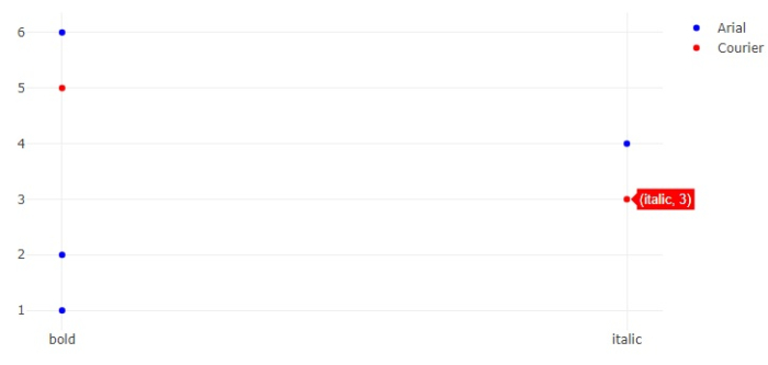
Observe that when you hover the mouse over a point, it will highlight all its values.

1K+ Views
