
Article Categories
- All Categories
-
 Data Structure
-
 Networking
-
 RDBMS
RDBMS
-
 Operating System
-
 Java
Java
-
 MS Excel
-
 iOS
iOS
-
 HTML
HTML
-
 CSS
CSS
-
 Android
-
 Python
-
 C Programming
-
 C++
C++
-
 C#
C#
-
 MongoDB
-
 MySQL
MySQL
-
 Javascript
-
 PHP
PHP
-
 Economics & Finance
Selected Reading
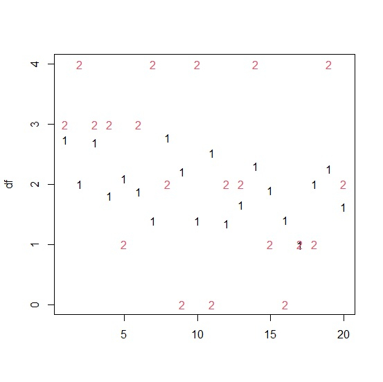
How to display the values of two columns of an R data frame separately in a plot?
In general, the scatterplot is used to visualize the relationship between two columns of an R data frame but if we want to display the two columns separately not as a pair then we need to use matplot function. This function will create a plot for all the values in the two columns and represent them by their column number.
Consider the below data frame −
Example
set.seed(222)
x<-rnorm(20,2,0.5)
y<- rpois(20,2)
df<-data.frame(x,y)
df
output
x y
1 2.7438785 3
2 1.9990540 4
3 2.6905104 3
4 1.8098932 3
5 2.0920681 1
6 1.8765521 3
7 1.3922195 4
8 2.7807025 2
9 2.2136551 0
10 1.3994882 4
11 2.5262292 0
12 1.3474682 2
13 1.6536962 2
14 2.3013244 4
15 1.9011235 1
16 1.4070627 0
17 0.9972435 1
18 2.0037549 1
19 2.2597452 4
20 1.6268523 2
Creating the plot for all the values in the two columns of data frame df −
matplot(df)
Output

Updated on: 2026-03-11T22:50:52+05:30
1K+ Views

Advertisements