
Article Categories
- All Categories
-
 Data Structure
-
 Networking
-
 RDBMS
RDBMS
-
 Operating System
-
 Java
Java
-
 MS Excel
-
 iOS
iOS
-
 HTML
HTML
-
 CSS
CSS
-
 Android
-
 Python
-
 C Programming
-
 C++
C++
-
 C#
C#
-
 MongoDB
-
 MySQL
MySQL
-
 Javascript
-
 PHP
PHP
How to display a variable as tooltip in ggplotly using R language?
R is a programming language for statistical computing and graphics. ggplotly() is a function used to convert static plots to web-based plots. ggplotly() returns a Plotly object. In this tutorial, we will see how to display a variable as tooltip in ggplotly using R language.
Here, we will use the aes() function that is used for aesthetic mapping between visual cue and a variable. It contains the following arguments: position (X and Y axes), color, fill, shape, line type, and size.
To set the tooltip text, we will use the ggplotly(tooltip = " ") method.
Follow the steps given below to display a variable as tooltip in ggplotly using R language.
Step 1
Make sure you have the following packages installed in R.
install.packages('ggplot2')
install.packages('plotly')
install.packages('readr')
Step 2
Next, load these installed libraries.
library(readr)
library(ggplot2)
library(plotly)
Step 3
Create a dataset by importing an external CSV file. You need to keep the CSV file in the project directory or provide the full path in the command given below ?
students_result <- read_csv("students_result.csv")
Step 4
Create a ggplot using the following arguments ?
p <- ggplot(data = students_result, aes(x = Year, y = expected, group = 1, text = paste("Count: ", final))) +
geom_line(colour = "#408FA6")
Step 5
Set the tooltip text using the following method ?
ggplotly(p, tooltip = "text")
Example
The complete code to display a variable as tooltip in ggplotly using R language as follows ?
install.packages('ggplot2')
install.packages('plotly')
install.packages('readr')

library(readr)
library(ggplot2)
library(plotly)

students_result <- read_csv("students_result.csv")
p <- ggplot(data = students_result, aes(x = Year, y = expected, group = 1, text = paste("Count: ", final))) +
geom_line(colour = "#408FA6")

ggplotly(p, tooltip = "text")
Output
It will produce the following output on the browser
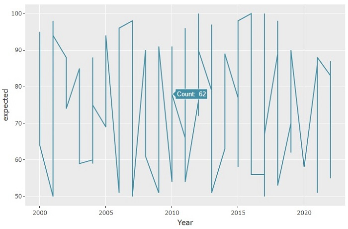
On the browser, when you hover the mouse over the graph, it will show you the tooltip text. Here we have set the "final" variable as the tooltip text.
Now, let's set another variable as the tooltip and check the output ?
p <- ggplot(data = students_result, aes(x = Year, y = expected, group = 1, text = paste("State: ", state))) +
geom_line(colour = "green")
With this modified code, you will get the following output on the browser ?
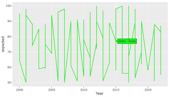
Observe that when you hover the mouse over the graph, it will show the "state" of the student as the tooltip. Here, we have also set the line color as "green".

2K+ Views
