
Article Categories
- All Categories
-
 Data Structure
-
 Networking
-
 RDBMS
RDBMS
-
 Operating System
-
 Java
Java
-
 MS Excel
-
 iOS
iOS
-
 HTML
HTML
-
 CSS
CSS
-
 Android
-
 Python
-
 C Programming
-
 C++
C++
-
 C#
C#
-
 MongoDB
-
 MySQL
MySQL
-
 Javascript
-
 PHP
PHP
Selected Reading
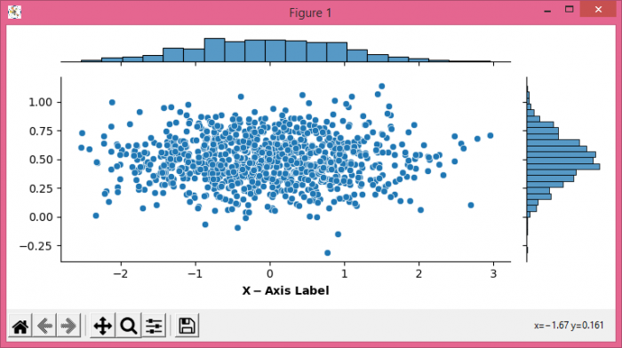
How to customize the axis label in a Seaborn jointplot using Matplotlib?
To customize the axis label in a Seaborn jointplot, we can take the following steps
- Set the figure size and adjust the padding between and around the subplots.
- Create x and y data points using numpy.
- Use jointplot() method to plot a joint plot in Seaborn.
- To set the customized axis label, we can use LaTex representation or set_xlabel() method properties.
- To display the figure, use show() method.
Example
import seaborn as sns
import numpy as np
from matplotlib import pyplot as plt
plt.rcParams["figure.figsize"] = [7.50, 3.50]
plt.rcParams["figure.autolayout"] = True
x = np.random.randn(1000,)
y = 0.2 * np.random.randn(1000) + 0.5
h = sns.jointplot(x, y, height=3.50)
h.ax_joint.set_xlabel('$\bf{X-Axis\ Label}$')
plt.show()
Output

Updated on: 2021-06-01T12:11:23+05:30
2K+ Views

Advertisements