
 Data Structure
 Networking
 RDBMS
RDBMS Operating System
 Java
Java MS Excel
 iOS
iOS HTML
HTML CSS
CSS Android
 Python
 C Programming
 C++
C++ C#
C# MongoDB
 MySQL
MySQL Javascript
 PHP
PHP
- Selected Reading
- UPSC IAS Exams Notes
- Developer's Best Practices
- Questions and Answers
- Effective Resume Writing
- HR Interview Questions
- Computer Glossary
- Who is Who
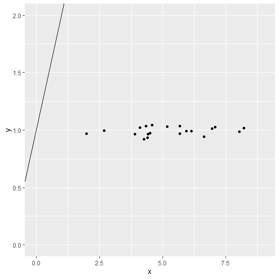
How to create scatterplot with intercept equals to 1 using ggplot2 in R?
To create a scatterplot with intercept equals to 1 using ggplot2, we can use geom_abline function but we need to pass the appropriate limits for the x axis and y axis values. For example, if we have two columns x and y in a data frame df and both have ranges starting from 0 to 5 then the scatterplot with intercept equals to 1 can be created as −
ggplot(df,aes(x,y))+geom_point()+geom_abline(intercept=1)+lims(x=c(0,5),y=c(0,5))
Example
Consider the below data frame −
x<-rnorm(20,5,1.12)
y<-rnorm(20,1,0.035)
df<-data.frame(x,y)
df
Output
      x       y
1 2.687278 0.9948582
2 4.410082 0.9646977
3 1.985577 0.9691989
4 8.218845 1.0174078
5 5.942984 0.9926087
6 4.346328 1.0340842
7 5.674543 0.9684308
8 6.138125 0.9891907
9 4.392059 0.9342166
10 8.028985 0.9871115
11 5.184612 1.0310949
12 3.896205 0.9636961
13 4.500758 0.9725633
14 6.950320 1.0140455
15 6.640275 0.9414716
16 7.071293 1.0262039
17 5.675679 1.0348059
18 4.104087 1.0214097
19 4.254315 0.9187824
20 4.585728 1.0420679
Loading ggplot2 package and the scatterplot with regression line having intercept equals to 1 −
Example
library(ggplot2)
ggplot(df,aes(x,y))+geom_point()+geom_abline(intercept=1)+lims(x=c(0,9),y=c(0,2))
Output

Updated on: 2020-12-08T07:00:50+05:30
175 Views

Advertisements