
Article Categories
- All Categories
-
 Data Structure
-
 Networking
-
 RDBMS
RDBMS
-
 Operating System
-
 Java
Java
-
 MS Excel
-
 iOS
iOS
-
 HTML
HTML
-
 CSS
CSS
-
 Android
-
 Python
-
 C Programming
-
 C++
C++
-
 C#
C#
-
 MongoDB
-
 MySQL
MySQL
-
 Javascript
-
 PHP
PHP
-
 Economics & Finance
How to create a plot for the response variable grouped by two columns using ggplot2 in R?
When two categorical variables make an impact on the response variable together then it is necessary to visualize their effect graphically because this graph helps us to understand the variation in the effect. Therefore, we can create a plot for the response variable that changes with one or both of the categorical independent variables. This can be done with the help of using interaction function in ggplot2.
Example
Consider the below data frame −
> set.seed(1)
> y Group1 Group2 df head(df,20)
y Group1 Group2
1    1 a Ph1
2    1 b Ph1
3    2 c Ph1
4    4 d Ph1
5    1 e Ph1
6    4 a Ph1
7    4 b Ph1
8    2 c Ph1
9    2 d Ph1
10   0 e Ph1
11   1 a Ph2
12   1 b Ph2
13   3 c Ph2
14   1 d Ph2
15   3 e Ph2
16   2 a Ph2
17   3 b Ph2
18   6 c Ph2
19   1 d Ph2
20   3 e Ph2
Loading ggplot2 package −
> library(ggplot2)
Creating the plot with interaction
> qplot(Group1, y, data=df, group=Group2, color=Group2, geom='line')+
+ geom_smooth(aes(group=interaction(Group1, Group2)))
`geom_smooth()` using method = 'loess' and formula 'y ~ x'
Output
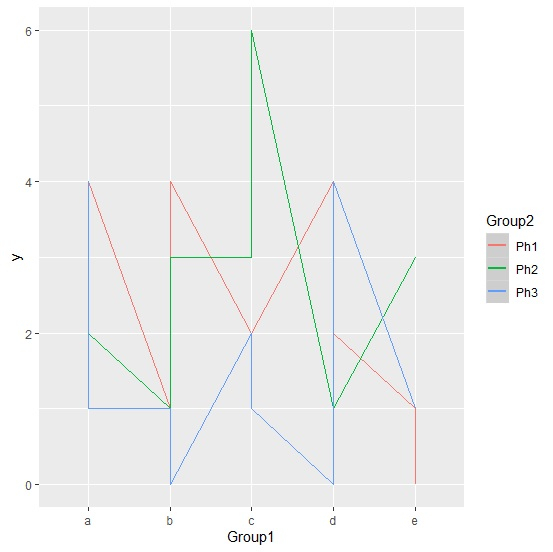
Here, we can see that all the lines are crossing each other therefore there exists an interaction effect of independent variables, which means at least one level combination of both the independent variables (Group1 and Group2) has different mean that the others.

173 Views
