
Article Categories
- All Categories
-
 Data Structure
-
 Networking
-
 RDBMS
RDBMS
-
 Operating System
-
 Java
Java
-
 MS Excel
-
 iOS
iOS
-
 HTML
HTML
-
 CSS
CSS
-
 Android
-
 Python
-
 C Programming
-
 C++
C++
-
 C#
C#
-
 MongoDB
-
 MySQL
MySQL
-
 Javascript
-
 PHP
PHP
Selected Reading
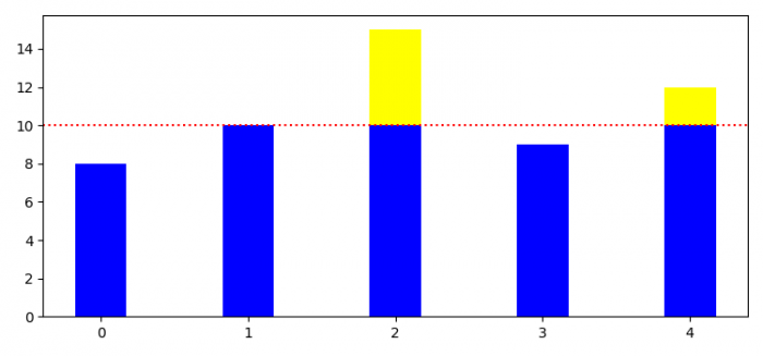
How to create a Matplotlib bar chart with a threshold line?
To create a Matplotlib bar chart with a threshold line, we have to use axhline() method.
Steps
- Set the figure size and adjust the padding between and around the subplots.
- Initialize a variable, threshold.
- Make lists for bars values.
- Get the below and above bar values based on the threshold value.
- Create a figure and a set of subplots using subplots() method.
- Plot bars with x, a_threshold and b_threshold values.
- Add a horizontal line across the axis using axhline() method.
- To display the figure, use show() method.
Example
import numpy as np
import matplotlib.pyplot as plt

plt.rcParams["figure.figsize"] = [7.50, 3.50]
plt.rcParams["figure.autolayout"] = True
threshold = 10
values = np.array([8.0, 10.0, 15.0, 9.0, 12.0])
x = range(len(values))

a_threshold = np.maximum(values - threshold, 0)
b_threshold = np.minimum(values, threshold)

fig, ax = plt.subplots()
ax.bar(x, b_threshold, 0.35, color="blue")
ax.bar(x, a_threshold, 0.35, color="yellow", bottom=b_threshold)

plt.axhline(threshold, color='red', ls='dotted')

plt.show()
Output

Updated on: 2021-06-03T09:20:34+05:30
4K+ Views

Advertisements