
 Data Structure
 Networking
 RDBMS
RDBMS Operating System
 Java
Java MS Excel
 iOS
iOS HTML
HTML CSS
CSS Android
 Python
 C Programming
 C++
C++ C#
C# MongoDB
 MySQL
MySQL Javascript
 PHP
PHP
- Selected Reading
- UPSC IAS Exams Notes
- Developer's Best Practices
- Questions and Answers
- Effective Resume Writing
- HR Interview Questions
- Computer Glossary
- Who is Who
How to create a dropdown navigation bar with CSS?
Dropdown navigation is a nav bar that contain dropdown option. You will see a lot of websites where 3rd or 4th item of the navigation has the dropdown feature.
When there are multiple options to render on nav bar item on the same category thats where you will need to develop a dropdown navigation bar. Suppose you are providing multiple types of services then you can not render all of them openly on the nav bar, you will put all of them in a dropdown. It is similar to hoverable dropdown menu.
Steps to Create a Dorpdown Navbar
Before proceeding to create a dropdown navbar we will create a dropdown structure first using HTML.
Step 1 - Add HTML:
We will create a structure of navigation bar, and we will use font-awesome icon package in our navbar as well to bring the down icon on the dropdown option. To learn about how you can include an icon package check this article.
- We will use HTML <nav> tag to wrap all the item of the menu to keep it aligned in the nav bar.
- Then we will create dropdown structure for that we can use <button>, <a> or <p> any element.
- Now we will create the dropdown item of navigation menu using <div< and <button> and <a> tag.
<!DOCTYPE html>
<html>
<head>
   <link rel="stylesheet"
         href=
"https://cdnjs.cloudflare.com/ajax/libs/font-awesome/4.7.0/css/font-awesome.min.css">
</head>
<body>
   <nav>
      <a class="links" href="#">Home</a>
      <a class="links" href="#">Services</a>
      <a class="links" href="#">Products</a>
      <div class="dropdown-menu">
         <button class="menu-btn">Dropdown
             <i class="fa fa-caret-down"></i>
         </button>
         <div class="menu-content">
             <a class="links-hidden" href="#">Contact Us</a>
             <a class="links-hidden" href="#">Visit Us</a>
             <a class="links-hidden" href="#">About Us</a>
         </div>
      </div>
   </nav>
</body>
</html>
Step 2 - Add CSS:
Here we have design the buttons and dropdown as per the need.
- We have use CSS 'display: inline-block'(CSS display Property) to keep the items in horizontal as we used to see on different navbars.
- To keep the dorpdown menu content hidden we have used the CSS 'display: hiden'. And CSS position property to keep the menu item positioned with respect to its containing block, and its edges are placed using the side-offset properties.
- To render the dropdown menu item over all other elements we have used the CSS z-index property.
<style>
    .menu-btn {
        background-color: #040008;
        color: white;
        padding: 16px;
        font-weight: bolder;
        font-family: "Segoe UI", Tahoma, Geneva, Verdana, sans-serif;
        border: none;
    }

    .dropdown-menu {
        position: relative;
        display: inline-block;
    }

    .menu-content {
        display: none;
        position: absolute;
        background-color: #3ff360;
        min-width: 110px;
        z-index: 1;
    }

    nav {
        background-color: #017575;
    }

    .links,
    .links-hidden {
        display: inline-block;
        color: rgb(255, 255, 255);
        padding: 8px 12px;
        text-decoration: none;
        font-size: 12px;
    }
    .links-hidden {
        display: block;
    }
    .links {
        display: inline-block;
    }

    .links-hidden:hover,
    .links:hover {
        transform: scale(1.2);

    }

    .dropdown-menu:hover .menu-content {
        display: block;
    }

</style>
Complete Example Code
In the following example we have combined the above step's pseudo code into a complete to code to achieve a dropdown navigation bar.
<!DOCTYPE html>
<html>
<head>
   <link rel="stylesheet"
         href=
"https://cdnjs.cloudflare.com/ajax/libs/font-awesome/4.7.0/css/font-awesome.min.css">
   <style>
         .menu-btn {
             background-color: #040008;
             color: white;
             padding: 16px;
             font-weight: bolder;
             font-family: "Segoe UI", Tahoma, Geneva, Verdana, sans-serif;
             border: none;
         }

         .dropdown-menu {
             position: relative;
             display: inline-block;
         }

         .menu-content {
             display: none;
             position: absolute;
             background-color: #3ff360;
             min-width: 110px;
             z-index: 1;
         }

         nav {
             background-color: #017575;
         }

         .links,
         .links-hidden {
             display: inline-block;
             color: rgb(255, 255, 255);
             padding: 8px 12px;
             text-decoration: none;
             font-size: 12px;
         }
         .links-hidden {
             display: block;
         }
         .links {
             display: inline-block;
         }

         .links-hidden:hover,
         .links:hover {
             transform: scale(1.2);

         }

         .dropdown-menu:hover .menu-content {
             display: block;
         }

   </style>
</head>
<body>
   <nav>
      <a class="links" href="#">Home</a>
      <a class="links" href="#">Services</a>
      <a class="links" href="#">Products</a>
      <div class="dropdown-menu">
         <button class="menu-btn">Dropdown
             <i class="fa fa-caret-down"></i>
         </button>
         <div class="menu-content">
             <a class="links-hidden" href="#">Contact Us</a>
             <a class="links-hidden" href="#">Visit Us</a>
             <a class="links-hidden" href="#">About Us</a>
         </div>
      </div>
   </nav>
</body>
</html>
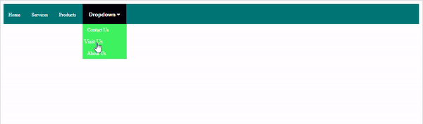
Ouptut
Conclusion
In this article we have learned how to create a dropdown navigation bar using HTML and CSS. Keeping dropdown hide until the user click or hover on it and render when the user click or hover on the element is the most important part to remember.

16K+ Views
