
Article Categories
- All Categories
-
 Data Structure
-
 Networking
-
 RDBMS
RDBMS
-
 Operating System
-
 Java
Java
-
 MS Excel
-
 iOS
iOS
-
 HTML
HTML
-
 CSS
CSS
-
 Android
-
 Python
-
 C Programming
-
 C++
C++
-
 C#
C#
-
 MongoDB
-
 MySQL
MySQL
-
 Javascript
-
 PHP
PHP
-
 Economics & Finance
Selected Reading
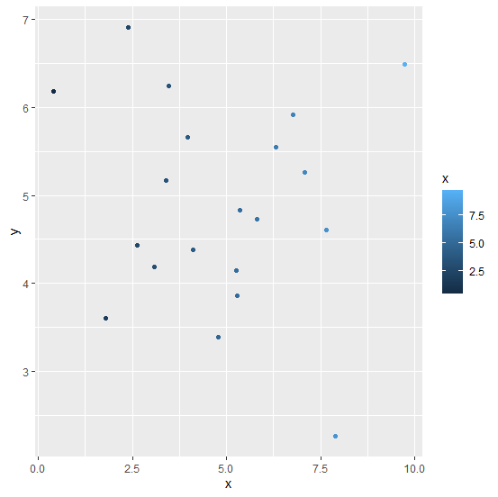
How to change the color of points in a scatterplot using ggplot2 in R?
To color the points in a scatterplot using ggplot2, we can use colour argument inside geom_point with aes. The color can be passed in multiple ways, one such way is to name the particular color and the other way is to giving a range or using a variable. If range or a variable will be used then the color of the points will be in different shades.
Example
ggplot(df,aes(x,y))+geom_point(aes(colour=x))
Output

Updated on: 2026-03-11T23:22:53+05:30
20K+ Views

Advertisements