
Article Categories
- All Categories
-
 Data Structure
-
 Networking
-
 RDBMS
RDBMS
-
 Operating System
-
 Java
Java
-
 MS Excel
-
 iOS
iOS
-
 HTML
HTML
-
 CSS
CSS
-
 Android
-
 Python
-
 C Programming
-
 C++
C++
-
 C#
C#
-
 MongoDB
-
 MySQL
MySQL
-
 Javascript
-
 PHP
PHP
-
 Economics & Finance
Selected Reading
How to change number formatting from scientific to numbers of axes labels in a scatterplot using ggplot2 package in R?
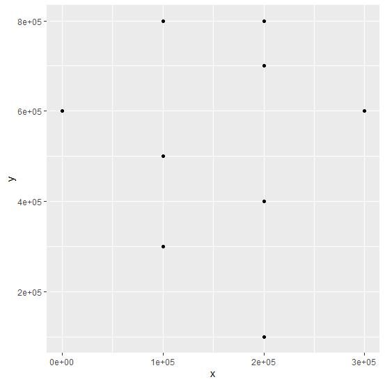
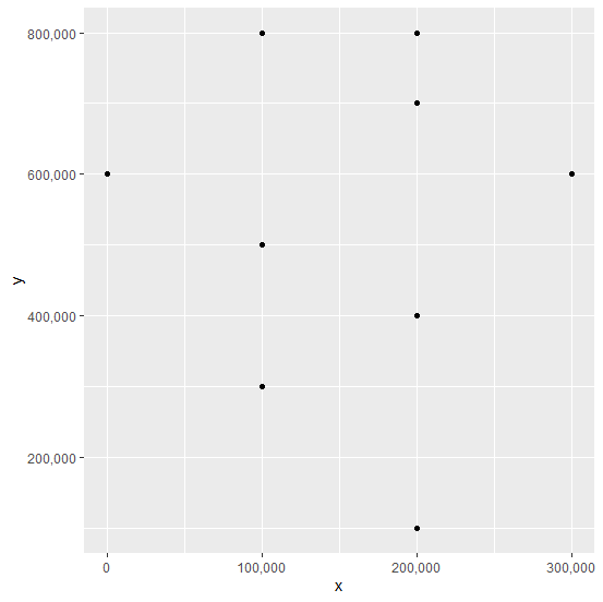
When we create a scatterplot or any other plot and the values are presented in scientific form in the original data then the axes values of the plot are also plotted in scientific form. This makes the plot ambiguous, therefore, reading the plot or interpreting it becomes difficult. Hence, we need to convert the scientific form of the axes labels to numbers and it can be done by using scale_x_continuous(labels =comma) and scale_y_continuous(labels=comma) for both the axes.
Example
Consider the below data frame −
set.seed(101)
x <-rpois(10,2)*100000
y <-rpois(10,5)*100000
df <-data.frame(x,y)
library(ggplot2)
Creating the scatterplot −
ggplot(df,aes(x,y))+geom_point()
Output
Creating the scatterplot with numbers on axes −
Example
ggplot(df,aes(x,y))+geom_point()+scale_x_continuous(labels = comma)+scale_y_continuous(labels=comma)
Output

Updated on: 2020-08-21T11:48:47+05:30
540 Views

Advertisements