
Article Categories
- All Categories
-
 Data Structure
-
 Networking
-
 RDBMS
RDBMS
-
 Operating System
-
 Java
Java
-
 MS Excel
-
 iOS
iOS
-
 HTML
HTML
-
 CSS
CSS
-
 Android
-
 Python
-
 C Programming
-
 C++
C++
-
 C#
C#
-
 MongoDB
-
 MySQL
MySQL
-
 Javascript
-
 PHP
PHP
-
 Economics & Finance
How to change chart axis labels' font color and size in Excel?
For instance, you have a chart in which the Y axis labels are integers. You now want to modify the font colour and font size of the labels in Excel based on the value scale; how can you solve this problem?
In this tutorial, we will discuss the process that makes it simple to alter the font color and size of labels in a specified axis of a chart in Excel.
Changing the Font Color and Size of Chart Axis Labels in Excel
We can modify the font color and size of any and all labels in a chart's X?axis or Y?axis with relative ease.
Let?s understand step by step with an example.
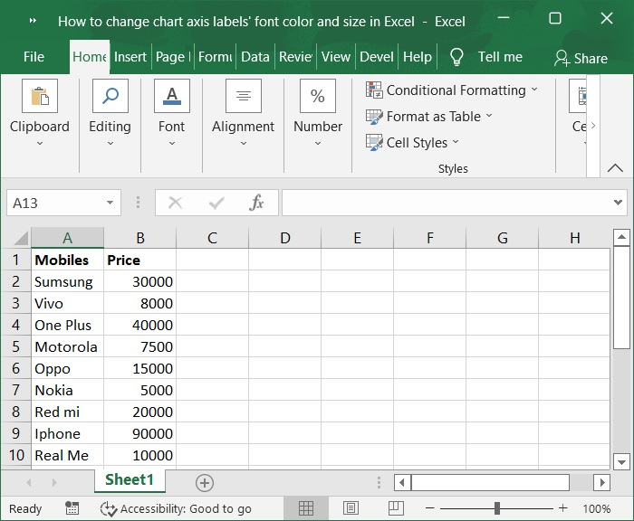
Step 1
In the first step, we must create sample data for chart in an excel sheet in columnar format as shown in the below screenshot.
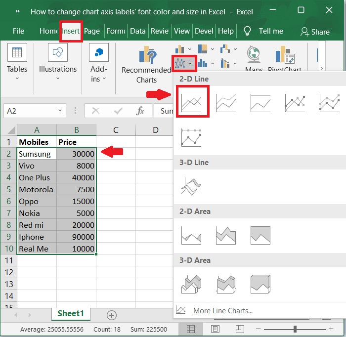
Step 2
Then, select the cells in the A1:B10 range. Click on insert tool bar and select Inert line or area chart > 2-D Line to display the graph for the above sample data. Below screenshot for the same.
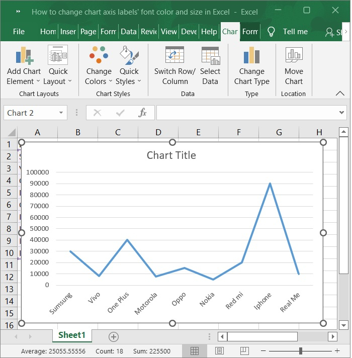
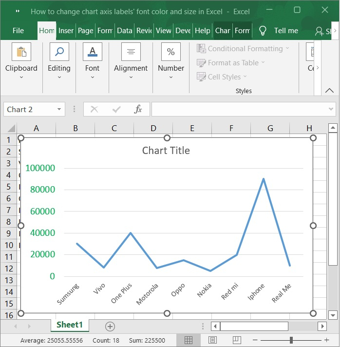
Step 3
Now, the chart is automatically populated upon selecting the above option. Refer to the below screenshot for same.
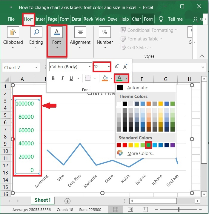
Step 4
Simply click on the x-axis for which you want to change the font colour and size of all labels in the chart, and then in the Font group on the Home tab, type a font size into the Font Size box, click the Font color button, and select a font color from the drop down list in the Font group. This will change the font color and size of all labels in the chart. Please refer to the screenshot below.
Step 5
Now, you can see the font color and size of all of the labels along the designated axis are then modified simultaneously. Below screenshot for the same.
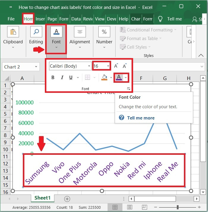
Step 6
Simply click on the y-axis for which you want to change the font colour and size of all labels in the chart, and then in the Font group on the Home tab, type a font size into the Font Size box, click the Font color button, and select a font color from the drop down list in the Font group. This will change the font color and size of all labels in the chart. Please refer to the screenshot below.
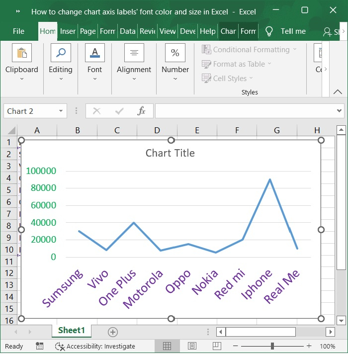
The final screen will appear as the one shown below ?
Conclusion
We hope this tutorial helped you understand how to change the font color and size of the chart axis labels in an Excel sheet.

5K+ Views
