
Article Categories
- All Categories
-
 Data Structure
-
 Networking
-
 RDBMS
RDBMS
-
 Operating System
-
 Java
Java
-
 MS Excel
-
 iOS
iOS
-
 HTML
HTML
-
 CSS
CSS
-
 Android
-
 Python
-
 C Programming
-
 C++
C++
-
 C#
C#
-
 MongoDB
-
 MySQL
MySQL
-
 Javascript
-
 PHP
PHP
Selected Reading
How to better rasterize a plot without blurring the labels in matplotlib?
To rasterize a plot in a bettery way without blurring the labels in matplotlib, we can take the following steps.
Steps
Set the figure size and adjust the padding between and around the subplots.
Create a figure and a set of subplots.
Axis 0 – Fill the area between the curve with alpha and rasterized=False.
Add text to the axes.
Axis 1 – Fill the area between the curve with alpha and rasterized=True.
Add text to the axes.
Axes 2 and 3 – Fill the area between the curve without alpha and rasterized=True and False, respectively.
Add text to the axes.
To display the figure, use Show() method.
Example
import matplotlib.pyplot as plt
import numpy as np

plt.rcParams["figure.figsize"] = [7.00, 3.50]
plt.rcParams["figure.autolayout"] = True

fig, axes = plt.subplots(nrows=4, sharex=True)

axes[0].fill_between(np.arange(1, 10), 1, 2, zorder=-1, alpha=0.2, rasterized=False)
axes[0].text(5, 1.5, "Label 1", ha='center', va='center', fontsize=25, zorder=-2, rasterized=True)

axes[1].fill_between(np.arange(1, 10), 1, 2, zorder=-1, alpha=0.2, rasterized=True)
axes[1].text(5, 1.5, "Label 2", ha='center', va='center', fontsize=25, zorder=-2, rasterized=True)

axes[2].fill_between(np.arange(1, 10), 1, 2, zorder=-1, rasterized=True)
axes[2].text(5, 1.5, "Label 3", ha='center', va='center', fontsize=25, zorder=-2, rasterized=True)

axes[3].fill_between(np.arange(1, 10), 1, 2, zorder=-1, rasterized=False)
axes[3].text(5, 1.5, "Label 4", ha='center', va='center', fontsize=25, zorder=-2, rasterized=True)

plt.show()
Output
It will produce the following output −
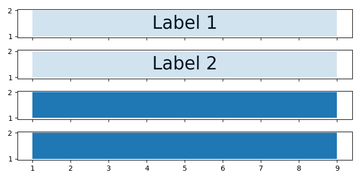
Observe that, since we have not used any "alpha" on axes 2 and 3, the labels are not visible.

Updated on: 2021-10-19T08:05:33+05:30
669 Views

Advertisements