
Article Categories
- All Categories
-
 Data Structure
-
 Networking
-
 RDBMS
RDBMS
-
 Operating System
-
 Java
Java
-
 MS Excel
-
 iOS
iOS
-
 HTML
HTML
-
 CSS
CSS
-
 Android
-
 Python
-
 C Programming
-
 C++
C++
-
 C#
C#
-
 MongoDB
-
 MySQL
MySQL
-
 Javascript
-
 PHP
PHP
-
 Economics & Finance
How to add labels in the checkbox in Material UI?
A key component of user interfaces, checkboxes make it simple for users to select options or express preferences. Sometimes, the users get to see multiple options to select from, and if there are no proper labels, they may get confused. To solve this issue, checkboxes can be easily and elegantly added to the applications using Material UI, a wellliked React component library. Although checkboxes in the Material UI lack labels by default, this can occasionally cause confusion among users.
In this article, we are going to learn how to create loading buttons in Material UI. Before going further in the article, we need to create a react project and also install the Material UI into it. So, let?s start and see the complete process of creating loading buttons.
What is a Checkbox in Material UI?
A user can toggle a small interactive box known as a check box or selection box to indicate a yes or no decision. It can also be found in Material UI as a prebuilt component that can be used without the need for any additional javascript or features, despite frequently appearing in HTML input forms.
Checkbox Label APIs
<Checkbox> This API is used to add checkbox component feature to the project using Material UI
<FormGroup> This API provides a compact row layout that helps in wrapping different form controls, including checkboxes.
<FormControlLabel> This API is used to add extra label to components such as Radio, Checkbox, and Switch components.
Steps to add checkbox labels
Below are the complete steps for adding labels to checkboxes in Material UI using React
Step 1: Create a new react app and Install MUI
To begin with, we must first have a React app with Material UI installed. Let?s create a new React app and install Mui by running the following command
npx create-react-app myproject
cd myproject

npm install @mui/material @emotion/react @emotion/styled
Step 2: Define a React component
Now, when the new React app is created, in the src folder there is a main App.js file. Open it, and add the below code
import React from "react";
export default function App() {
   return (
      ?
   )
}
Step 3: Import the required components
Once we have defined the new component, it's time to import the different components needed to add labels to checkboxes.
import { FormGroup, FormControlLabel', Checkbox } from '@mui/material
A detailed description of all of these components in Material UI has been discussed above.
Step 4: Add labels to the checkbox
To incorporate labels, into checkboxes in React using Material UI, we follow these steps. Firstly we utilize the FormGroup component to group the checkboxes. Then we employ the FormControlLabel to exhibit the labels, alongside each checkbox. For example, we will explore methods of labeling checkboxes.
<FormGroup>
   <FormControlLabel control={<Checkbox />} label="Add your labels here?" />
   ?
</FormGroup>
Example
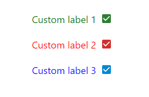
In this example, we created labels without using the FormGroup or FormControlLabel API?s. Inside the span tag, we used a label tag to display the checkbox labels and a checkbox, which is rendering it as a flex of row to act as the original checkbox label.
import Checkbox from "@mui/material/Checkbox";
import React from "react";

export default function App() {
   return (
      <div
         style={{
            display: "flex",
            marginTop: 30,
            flexDirection: "column",
            alignItems: "center",
            justifyContent: "center",
            gap: 10,
         }}>
         <span style={{display: "flex", justifyContent: 'center', alignItems: 'center'}}>
            <label style={{fontSize: 20, color: 'green'}}>Custom label 1</label>
            <Checkbox color="success" />
         </span>
         <span style={{display: "flex", justifyContent: 'center', alignItems: 'center'}}>
            <label style={{fontSize: 20, color: 'red'}}>Custom label 2</label>
            <Checkbox color="error" />
         </span>
         <span style={{display: "flex", justifyContent: 'center', alignItems: 'center'}}>
            <label style={{fontSize: 20, color: 'blue'}}>Custom label 3</label>
            <Checkbox color="info" />
         </span>
      </div>
   );
}
Output
Example
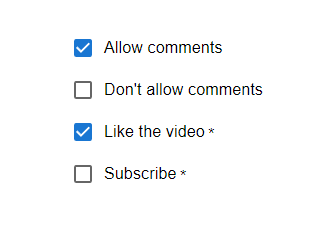
In this example, we have created labels using the FormGroup or FormControlLabel API. To add labels, we have used the FormControlLabel component, which first renders the control Checkbox, and apart from this, it also renders the label of the checkboxes.
import FormGroup from '@mui/material/FormGroup';
import FormControlLabel from '@mui/material/FormControlLabel';
import Checkbox from '@mui/material/Checkbox';
import React from "react";

export default function App() {
   return (
      <div
         style={{
            display: "flex",
            marginTop: 30,
            flexDirection: "row",
            alignItems: "center",
            justifyContent: "center",
            gap: 10,
         }}>
         <FormGroup>
            <FormControlLabel control={<Checkbox defaultChecked />} label="Allow comments" />
            <FormControlLabel control={<Checkbox />} label="Don't allow comments" />
            <FormControlLabel required control={<Checkbox />} label="Like the video" />
            <FormControlLabel required control={<Checkbox />} label="Subscribe" />
         </FormGroup>
      </div>
   );
}
Output
Example
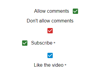
In this example we've utilized the FormGroup or FormControlLabel API to generate labels. The labels are added using the FormControlLabel component, which not displays the checkboxes but also includes the labels, for them. Additionally we've made use of the labelPlacement property to modify the label positions allowing them to be placed on top, bottom, start or end.
import FormGroup from "@mui/material/FormGroup";
import FormControlLabel from "@mui/material/FormControlLabel";
import Checkbox from "@mui/material/Checkbox";
import React from "react";

export default function App() {
   return (
      <div
         style={{
            display: "flex",
            marginTop: 30,
            flexDirection: "row",
            alignItems: "center",
            justifyContent: "center",
            gap: 10,
         }}>
         <FormGroup>
            <FormControlLabel
               control={<Checkbox defaultChecked color="success" />}
               label="Allow comments"
               labelPlacement="start"
            />
            <FormControlLabel
               control={<Checkbox color="error" />}
               label="Don't allow comments"
               labelPlacement="top"
            />
            <FormControlLabel
               required
               control={<Checkbox color="success" />}
               label="Subscribe"
               labelPlacement="end"
            />
            <FormControlLabel
               required
               control={<Checkbox color="info" />}
               label="Like the video"
               labelPlacement="bottom"
            />
         </FormGroup>
      </div>
   );
}
Output
Example
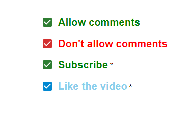
In this example we have utilized the FormGroup or FormControlLabel API to generate labels. To include labels we employ the FormControlLabel component. This component renders the checkboxes as their corresponding labels. In our case we have customized the appearance of the labels using the sx prop, which applies styles, from the MuiFormControlLabel label class to control factors such, as color, fontWeight fontSize and more.
import FormGroup from "@mui/material/FormGroup";
import FormControlLabel from "@mui/material/FormControlLabel";
import Checkbox from "@mui/material/Checkbox";
import React from "react";

export default function App() {
   return (
      <div
         style={{
            display: "flex",
            marginTop: 30,
            flexDirection: "row",
            alignItems: "center",
            justifyContent: "center",
            gap: 10,
         }}>
         <FormGroup>
            <FormControlLabel
               control={<Checkbox defaultChecked color="success" />}
               label="Allow comments"
               labelPlacement="end"
               sx={{
                  '& .MuiFormControlLabel-label': {
                     color: 'green',
                     fontSize: '20px',
                     fontWeight: 'bold'
                  },
               }}
            />
            <FormControlLabel
               control={<Checkbox color="error" />}
               label="Don't allow comments"
               labelPlacement="end"
               sx={{
                  '& .MuiFormControlLabel-label': {
                     color: 'red',
                     fontWeight: 'bold',
                     fontSize: '20px',
                  },
               }}
            />
            <FormControlLabel
               required
               control={<Checkbox color="success" />}
               label="Subscribe"
               labelPlacement="end"
               sx={{
                  '& .MuiFormControlLabel-label': {
                     color: 'green',
                     fontWeight: 'bold',
                     fontSize: '20px',
                  },
               }}
            />
            <FormControlLabel
               required
               control={<Checkbox color="info" />}
               label="Like the video"
               labelPlacement="end"
               sx={{
                  '& .MuiFormControlLabel-label': {
                     color: 'skyblue',
                     fontWeight: 'bold',
                     fontSize: '20px',
                  },
               }}
            />
         </FormGroup>
      </div>
   );
}
Output
Conclusion
We have seen how to add labels to checkboxes in this article using Material UI. We have learned the complete stepbystep process for the same and also seen the different approaches to adding or customizing the labels in React using Material UI. To make your checkboxes and labels match your application's design or UI and enhance the user experience generally, keep in mind that customization is essential, and for that, we have seen the usage of sx prop in the examples too.

892 Views
