
Article Categories
- All Categories
-
 Data Structure
-
 Networking
-
 RDBMS
RDBMS
-
 Operating System
-
 Java
Java
-
 MS Excel
-
 iOS
iOS
-
 HTML
HTML
-
 CSS
CSS
-
 Android
-
 Python
-
 C Programming
-
 C++
C++
-
 C#
C#
-
 MongoDB
-
 MySQL
MySQL
-
 Javascript
-
 PHP
PHP
-
 Economics & Finance
How to add dotted forecast line in an Excel line chart?
A chart has data from the past (actual data) and the future (predicted future data), with the historical data represented by a line that is continuous and the future data represented by lines that are dashed. Considering that you have a line chart which displays the actual data, you an also add the forecast data as another data series. Then, the question is how to add a dotted line to the line chart that already exists to show the new predictions.
Dotted Forecast Line
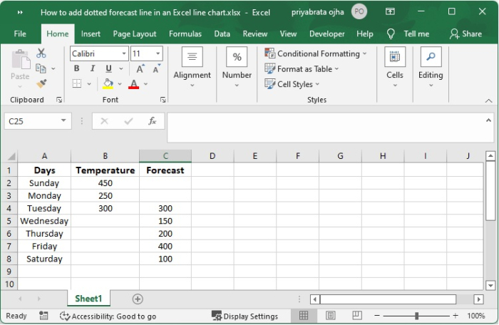
Let's imagine you designed a line chart to demonstrate the average temperature of the city over the period of a week. For the first half of the week, as seen in the picture below, you should be aware that you still need to predict the temperature for the second half of the week.
Step 1
The actual numbers achieved up to this point are shown by a continuous line, while the forecasted values are represented by a dashed line. The chart type is set to a line chart, and the actual values as well as the predicted values are shown as two separate data series. The chart's data are organised in the manner that is shown below.
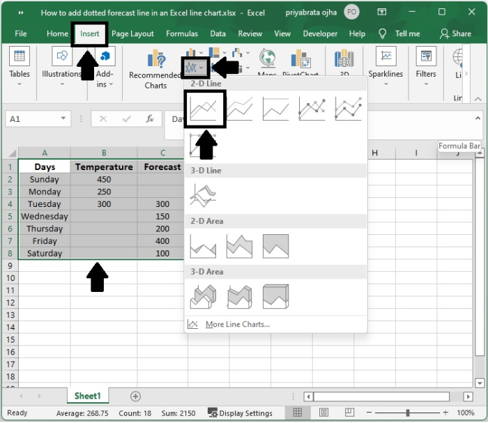
Step 2
After selecting all of the data, go to the Insert tab and pick "Insert Line or Area Chart" from the drop-down menu in the Charts section. Afterwards, pick the 2D line chart option.
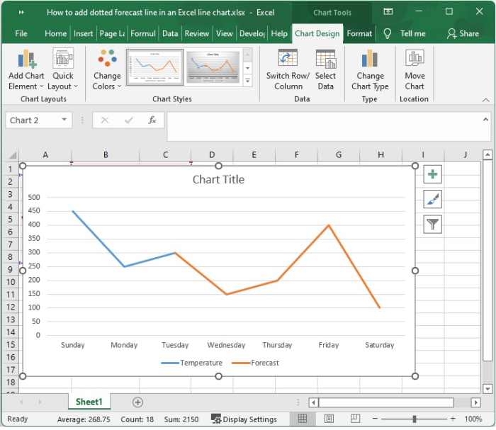
Step 3
The line chart that has been appearing looks like this.
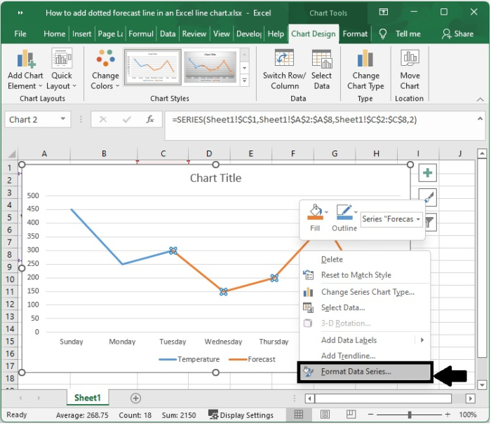
Step 4
Then right-click on the yellow line that represents the forecast data and select the "Format Data series" option
Step 5
Select fill & Line in Series Options and click on Dash type dropdown.
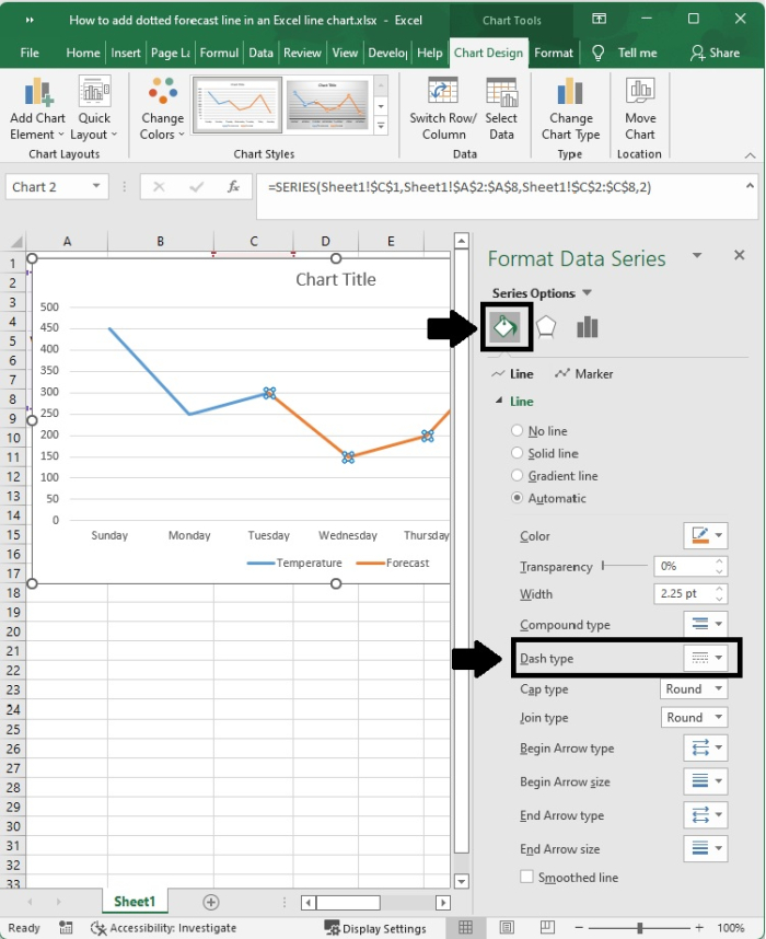
Step 6
Choose the Square Dot from the drop-down list located next to the Dash type.
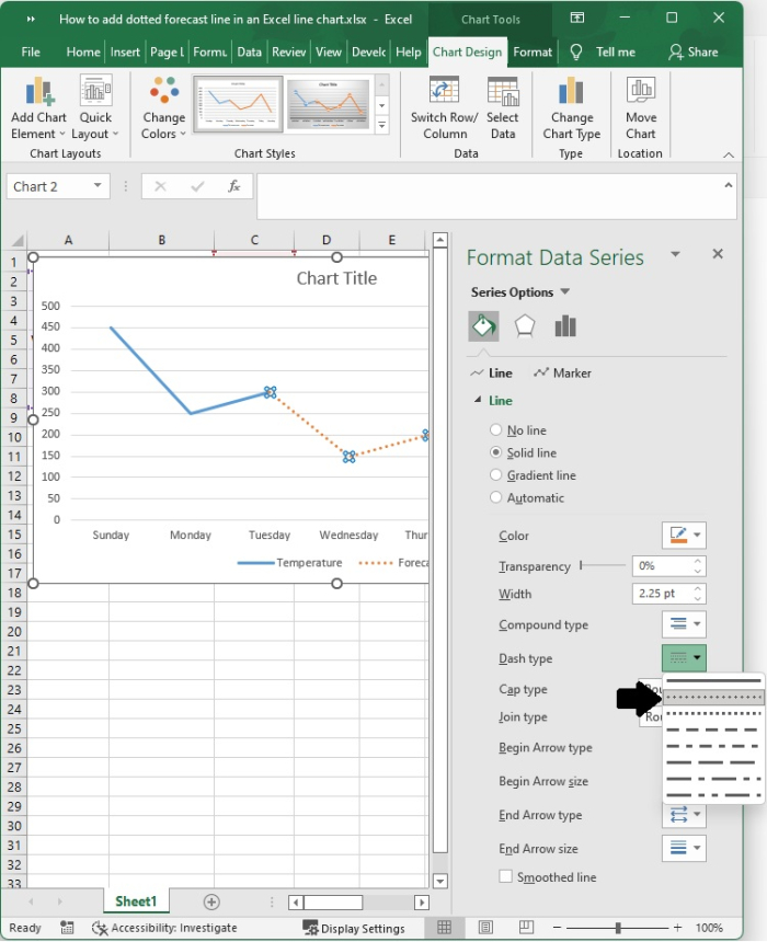
You have the option to choose any other kind of line you wish to use.
Step 7
After that, a line chart is produced. In the graphic, the section of the line that is solid represents the actual values, while the part of the line that is dotted represents the predicted values.
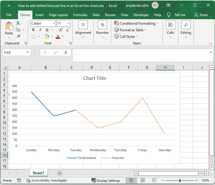
Conclusion
In this tutorial, we used an example to demonstrate how you can add a dotted forecast line in an Excel line chart.

6K+ Views
