
Article Categories
- All Categories
-
 Data Structure
-
 Networking
-
 RDBMS
RDBMS
-
 Operating System
-
 Java
Java
-
 MS Excel
-
 iOS
iOS
-
 HTML
HTML
-
 CSS
CSS
-
 Android
-
 Python
-
 C Programming
-
 C++
C++
-
 C#
C#
-
 MongoDB
-
 MySQL
MySQL
-
 Javascript
-
 PHP
PHP
-
 Economics & Finance
How to add average/grand total line in a pivot chart in Excel
Have you ever attempted to include an average line or grand total line in an Excel pivot chart? It appears difficult to show or add an average/grand total line like you would in a typical chart.
Create Pivot table
Let?s understand step by step with an example.
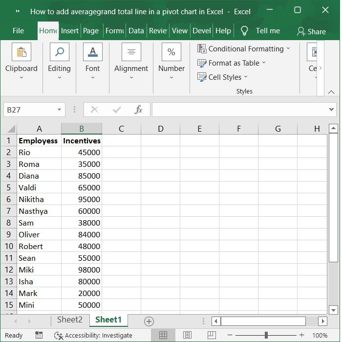
Step 1
In the first, we must create a sample data for creating pivot table as shown in the below screenshot.
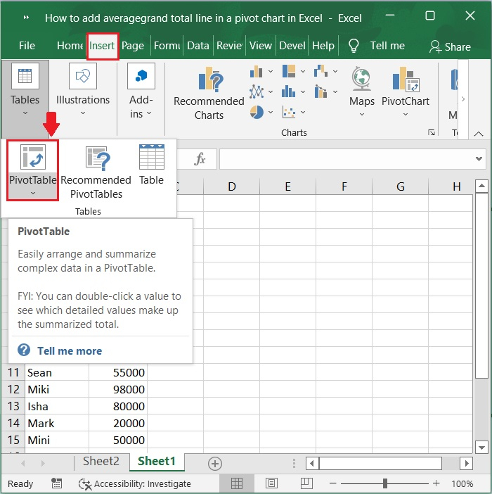
Step 2
Now, select the data range from A1:B15. Click on the Insert tab on the toolbar ribbon and then select pivot table option to insert pivot table for the selected data range. Refer to the below screenshot for the same.
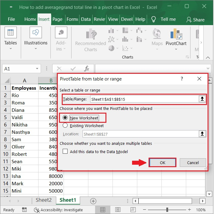
Step 3
In the next step, create pivot table window appears, make sure the data range is selected as A1:B15 under select table/range option. Now, choose new worksheet to create the pivot table in separate sheet then click on OK button.
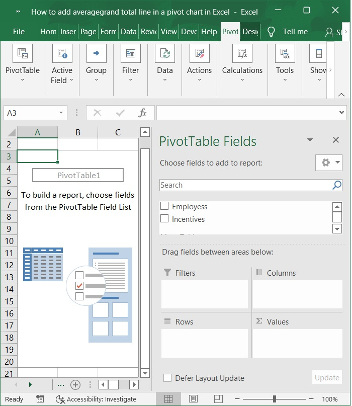
Step 4
The pivot table is now created in a separate worksheet as shown below.
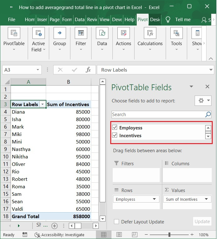
Step 5
In the Pivot table fields check employees and incentives. After those values appear.
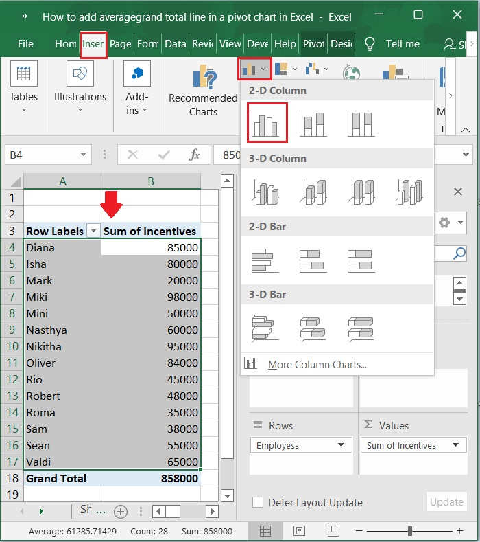
Step 6
Now, select the data range A4:B17 and click on insert chart tab to insert the bar chart>2-D column. As shown in the below screenshot.
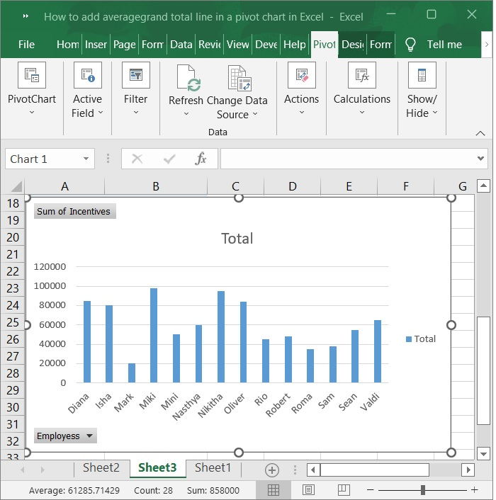
Step 7
And based on the above range, you've created a pivot table and a chart, as shown in the screenshot below.
Add average/grand total line in a pivot chart in excel
Now, you may follow these steps to add an average line or grand total line to an Excel pivot chart.
Step 8
By selecting Insert from the right-click menu after selecting the Incentives column in the source data, a column will be added before the Incentives column.
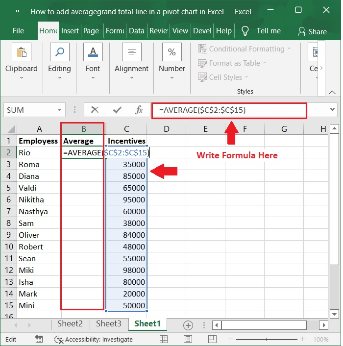
Step 9
Type "Average" in Cell B1 of the new Column, enter the formula in Cell B2 and drag the Fill Handle to Range B3:B15. Refer to the below screenshot.
Formula
=AVERAGE($C$2:$C$15)

Step 10
Click the Pivot Chart, and then under the Analyze tab, click the Refresh button. See the below screenshot.
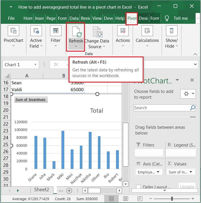
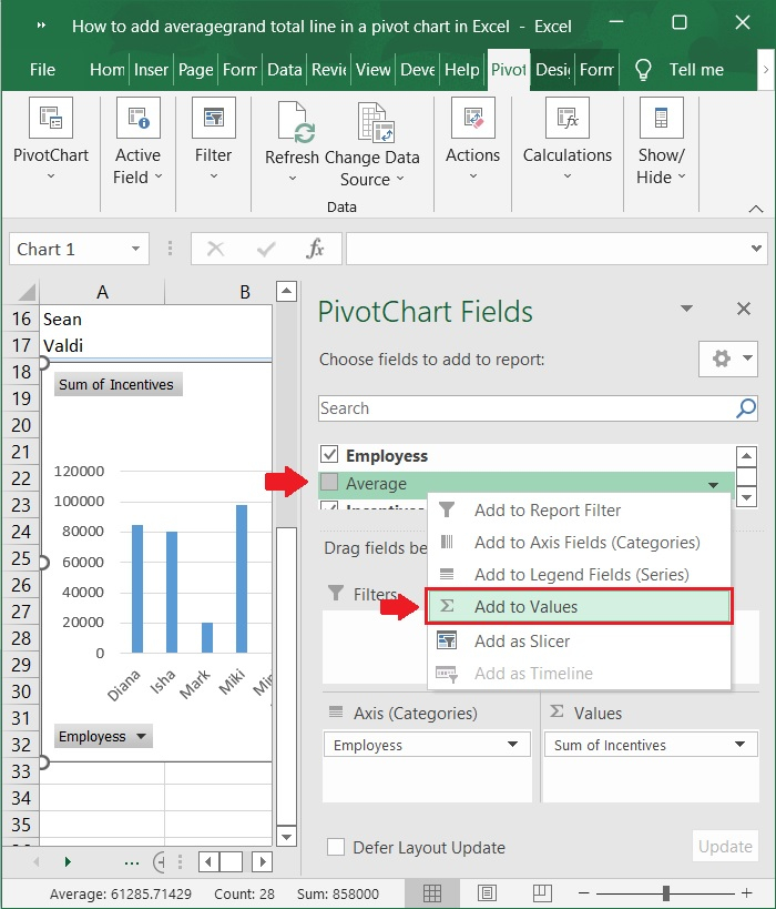
Step 11
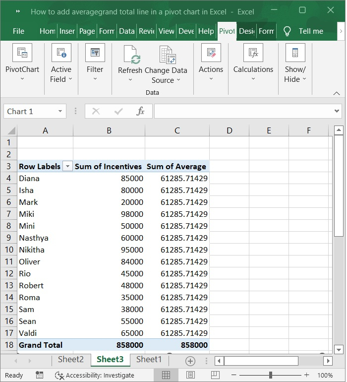
The Average field (or Grand Total field) has now been added to the PivotChart Fields pane. To add the field to the Values section, check the Average (or Grand Total) box and right click and select add to values. As shown in the below screenshot.
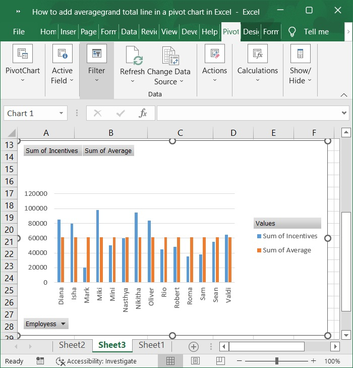
Step 12
The Pivot Chart now includes the average filed (or Grand Total filed). Refer to the below screenshot.
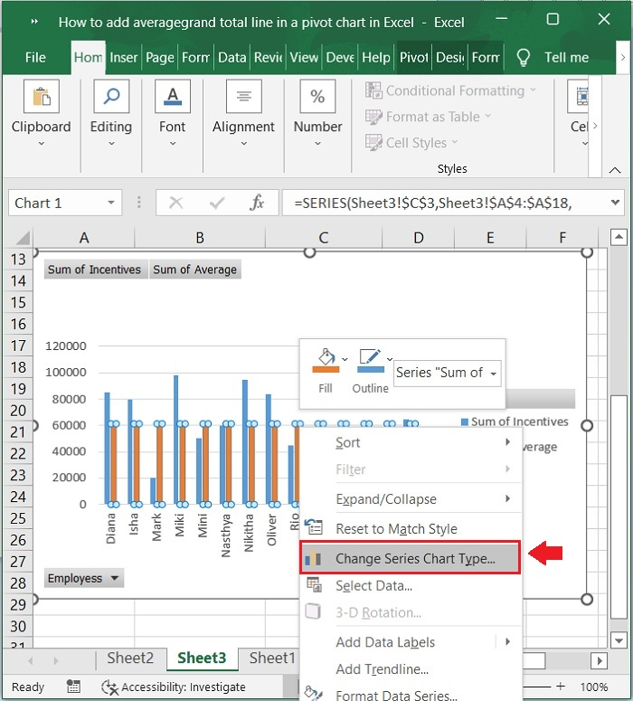
Step 13
Then, right-click the average filed (or Grand Total filed) and select Change Series Chart Type. As shown in the below screenshot.
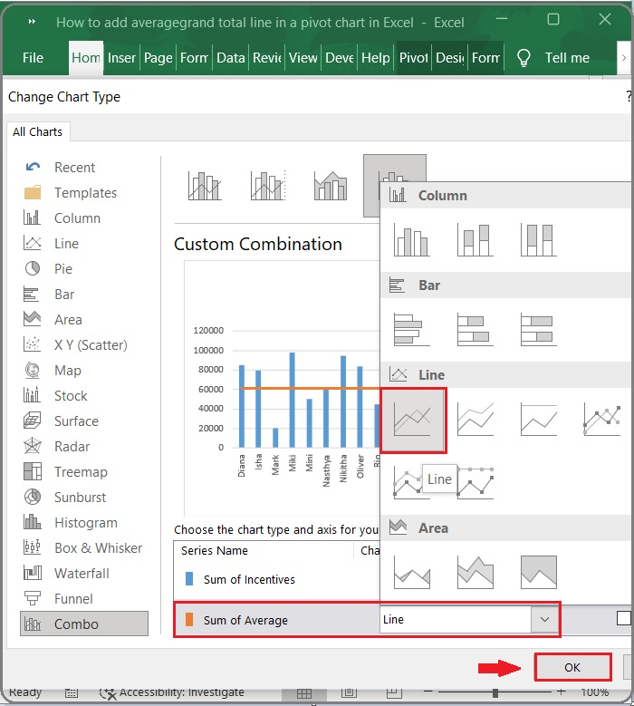
Step 14
In the Change Chart Type dialog box that appears, click Combo in the left pane, and in the Choose the chart type and axis for your data series box, click the Sum of Average box and select the Line from the dropdown list, then click the OK button. See the below screenshot.
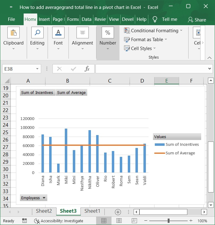
Step 15
The average line (or grand total line) is now added to the Pivot Chart all at once. Refer to the below screenshot.
Conclusion
In this article, I'll show you how to effortlessly add an average/grand total line to an Excel pivot chart.

45K+ Views
