
Article Categories
- All Categories
-
 Data Structure
-
 Networking
-
 RDBMS
RDBMS
-
 Operating System
-
 Java
Java
-
 MS Excel
-
 iOS
iOS
-
 HTML
HTML
-
 CSS
CSS
-
 Android
-
 Python
-
 C Programming
-
 C++
C++
-
 C#
C#
-
 MongoDB
-
 MySQL
MySQL
-
 Javascript
-
 PHP
PHP
-
 Economics & Finance
How to add arrows to line / column chart in Excel
If your worksheet has a column chart or a line chart, you may find that you need to add arrows to the column chart in order to show how the values are related to one another in terms of increasing or decreasing. In point of fact, there is not a direct method for adding the arrows to the column bar; nevertheless, you can draw the arrow shapes and copy them to the column chart. In this article, I'll discuss the process of adding arrows to a line or column chart.
Add arrows to column chart in excel
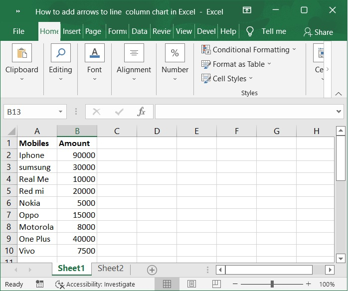
Step 1
In the first, we must create a sample data for chart in an excel sheet in columnar format as shown in the below screenshot.
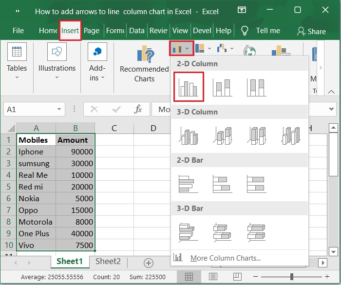
Step 2
Then, select the cells in the A1:B10 range. Click on Insert tool bar and select bar chart>2-D column to display the graph for the above sample data. Below is the screenshot for the same.
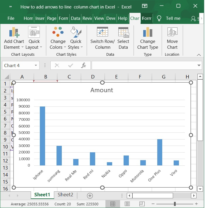
Step 3
Now, the chart is automatically populated upon selecting the above option. Refer to the below screenshot.
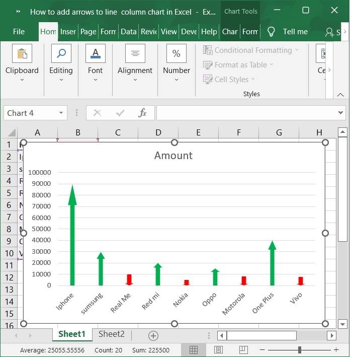
Now, I have a range of data and a column chart based on it, and I wish to add up and down arrows based on the data. The steps to transform these data columns to arrows are as follows.
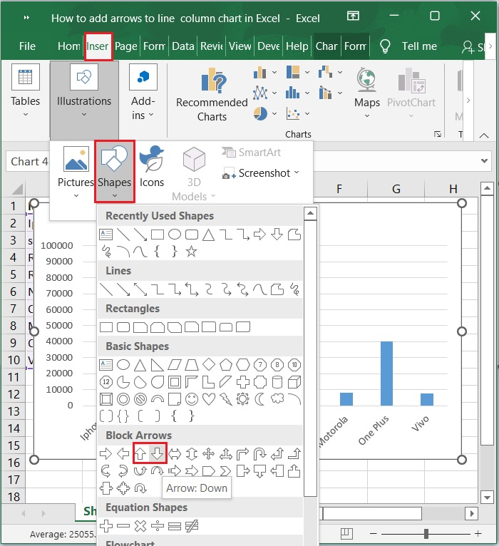
Step 4
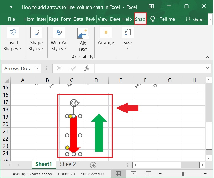
Insert an arrow shape into a blank part of this worksheet by selecting Insert > Shapes and then selecting either Up Arrow or Down Arrow from the Block Arrows section.
Step 5
Then, you can drag the mouse to make the arrows look how you want, and you can change the styles of the arrows to as you need. As shown in the below screenshot.
Step 6
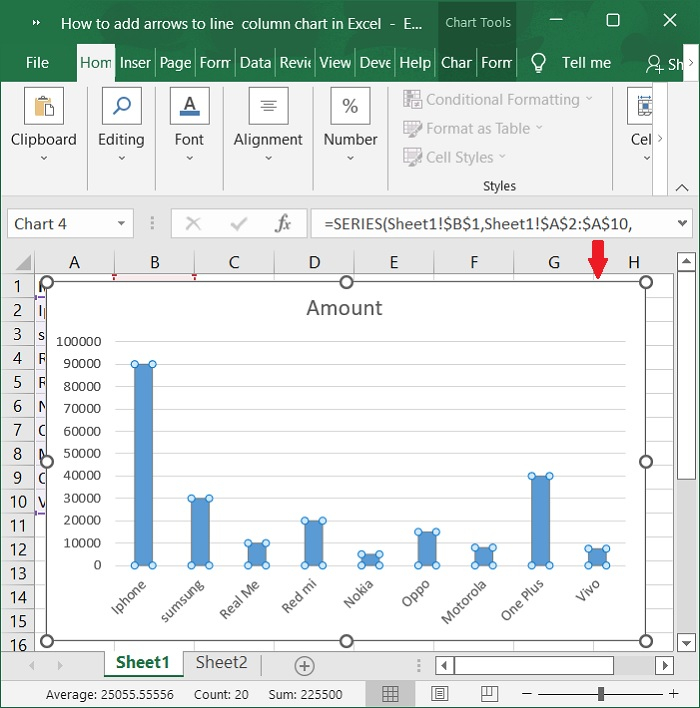
Choose the arrow you want to use and press Ctrl + C to copy it. Then, click a column in the chart to select all the columns. Below is the screenshot for the same.
Step 7
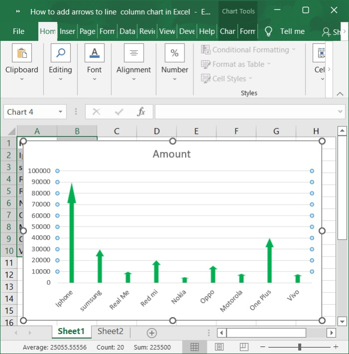
Then, press Ctrl+V to paste the arrow onto the chart.
Step 8
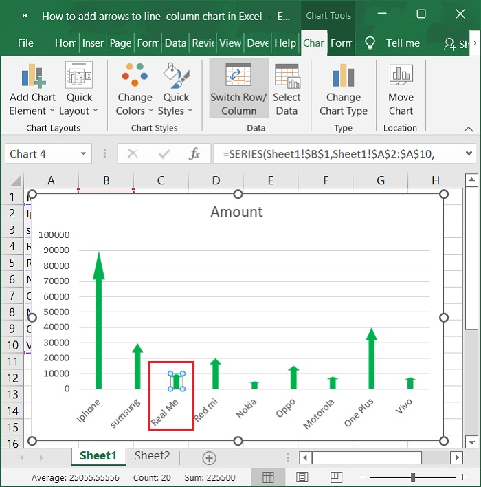
If you want to add an up arrow and a down arrow, all you have to do is choose one column as shown in below screenshot.
Step 9
If you want to add an up arrow and a down arrow, all you have to do is choose one column and paste your desired arrows over and over again.
Add arrows to line chart in excel
You can also add arrows to a line chart to show how the data is changing. Please follow below steps.
Step 1
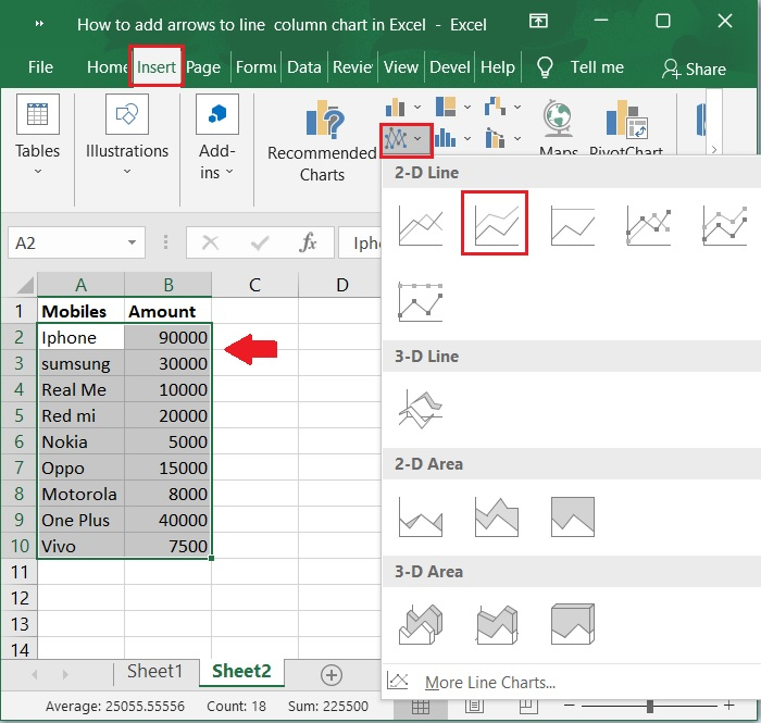
Then, select the cells in the A1:B10 range. Click on Insert tool bar and select chart>Line>2-D Line to display the Line graph. Below is the screenshot for the same.
Step 2
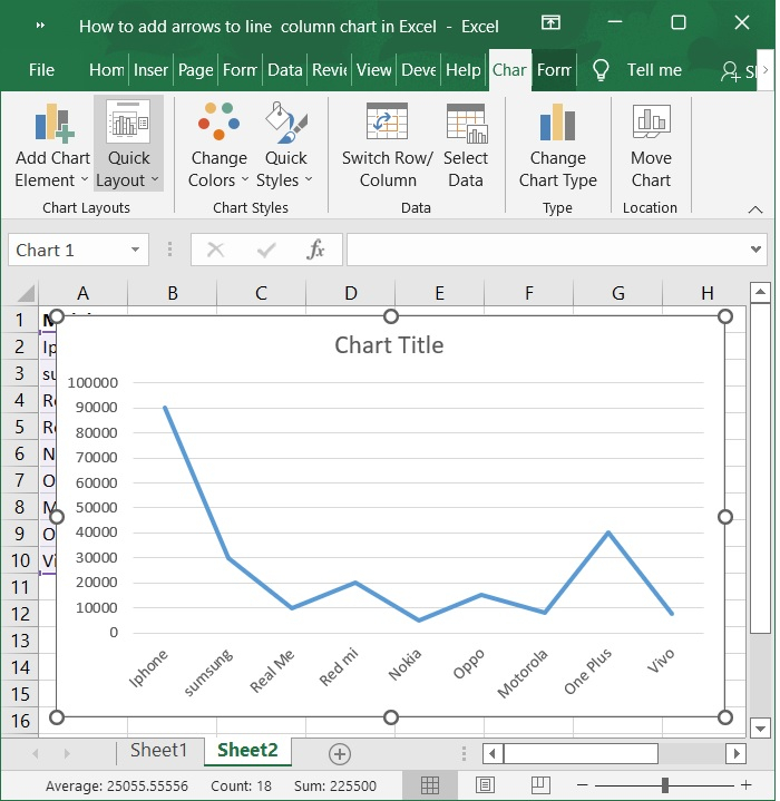
Now, the chart is automatically populated upon selecting the above option. Refer to the below screenshot.
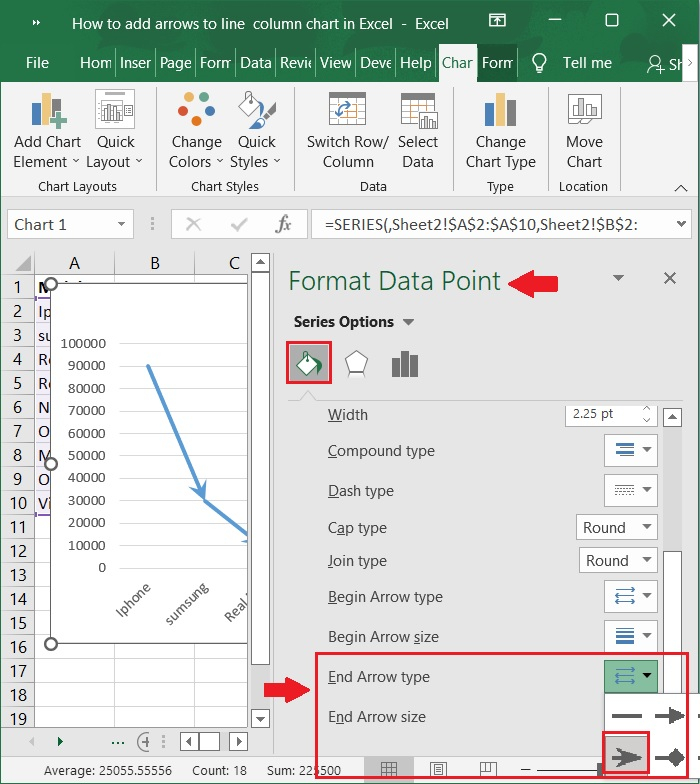
Step 3
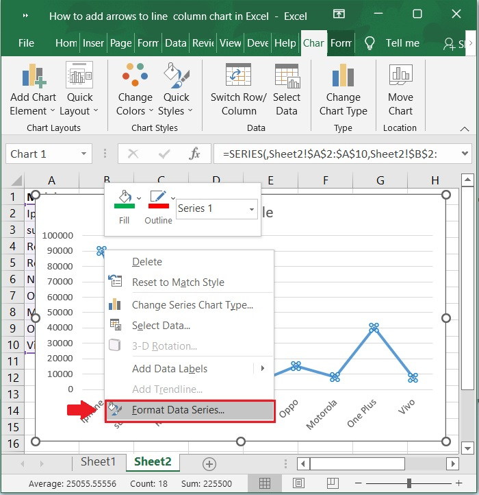
Select the data line in the line chart you made and right-click on it. Then, from the menu that pops up, choose Format Data Series, see the below screenshot.
Step 4
Now, the Format Data Series window is populated on the right side of the excel window. Then click on the Color icon and then click on Marker and the navigate to Marker options, under marker options, check the Built-in checkbox and select any shape from Type dropdown to make it as data pointer. We can enter the numbers from 1-72 to increase or decrease the selected mark size. In the below screenshot a solid circle is selected as Built-in mark.
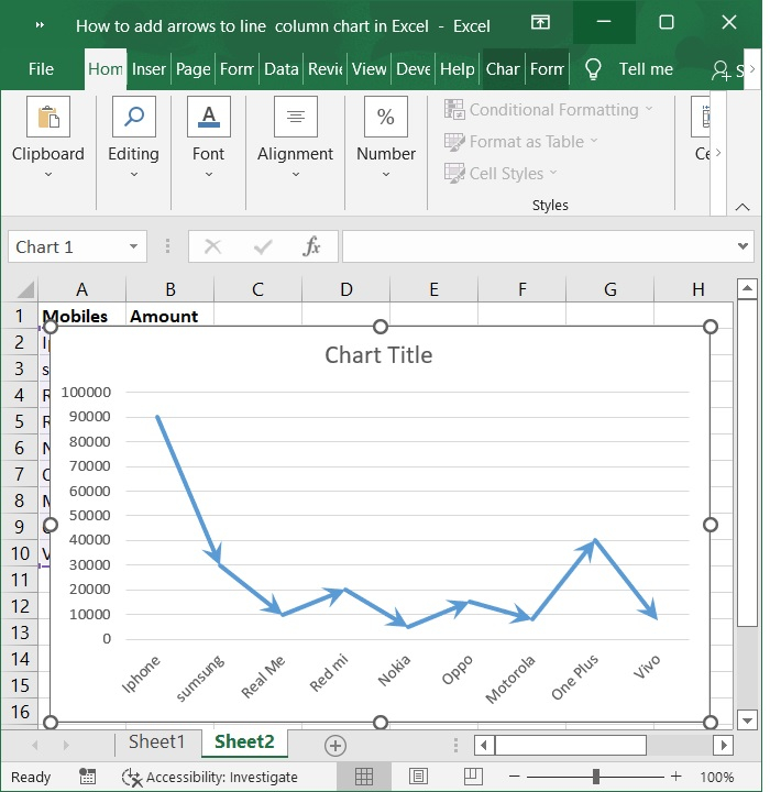
Step 5
Finally, the line chart with markers is populated as shown in the below screenshot.
Conclusion
In this article we have learnt how to add up and down arrows in bar chart and also learnt about adding the mark pointers in line chart.

2K+ Views
