
 Data Structure
 Networking
 RDBMS
RDBMS Operating System
 Java
Java MS Excel
 iOS
iOS HTML
HTML CSS
CSS Android
 Python
 C Programming
 C++
C++ C#
C# MongoDB
 MySQL
MySQL Javascript
 PHP
PHP
- Selected Reading
- UPSC IAS Exams Notes
- Developer's Best Practices
- Questions and Answers
- Effective Resume Writing
- HR Interview Questions
- Computer Glossary
- Who is Who
How can matplotlib be used to create histograms using Python?
Matplotlib is a popular Python package that is used for data visualization.
Visualizing data is a key step since it helps understand what is going on in the data without actually looking at the numbers and performing complicated computations.
It helps in communicating the quantitative insights to the audience effectively.
Matplotlib is used to create 2 dimensional plots with the data. It comes with an object oriented API that helps in embedding the plots in Python applications. Matplotlib can be used with IPython shells, Jupyter notebook, Spyder IDE and so on.
It is written in Python. It is created using Numpy, which is the Numerical Python package in Python.
Python can be installed on Windows using the below command −
pip install matplotlib
The dependencies of Matplotlib are −
Python ( greater than or equal to version 3.4)
NumPy
Setuptools
Pyparsing
Libpng
Pytz
Free type
Six
Cycler
Dateutil
Let us understand how Matplotlib can be used to plot a histogram in a plot −
Example
import matplotlib
import numpy as np
import matplotlib.pyplot as plt
np.random.seed(19875871)
meanVal = 125
stdDevVal = 35
x = meanVal + stdDevVal * np.random.randn(764)
num_bins = 36
fig, ax = plt.subplots()
n, bins, patches = ax.hist(x, num_bins, density=True)
y = ((1 / (np.sqrt(2 * np.pi) * stdDevVal)) *
np.exp(−0.5 * (1 / stdDevVal * (bins - meanVal))**2))
ax.plot(bins, y, '−−')
ax.set_xlabel('X−axis')
ax.set_ylabel('y−axis')
ax.set_title('A simple histogram')
fig.tight_layout()
plt.show()
Output
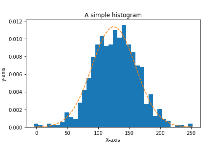
Explanation
The required packages are imported and its alias is defined for ease of use.
The data is created using the ‘random’ library’s ‘seed’ function.
The ‘mean’ and ‘standard deviation’ values are defined.
The number of bins, i.e the number of rectangular blocks that need to be shown in the histogram is defined.
An empty figure is created using the ‘figure’ function.
The ‘hist’ function is used to create a histogram.
The data is plotted using the ‘plot’ function.
The set_xlabel, set_ylabel and set_title functions are used to provide labels for ‘X’ axis, ‘Y’ axis and title.
The distribution is also shown using dotted lines- which is a bell shaped curve.
It is shown on the console using the ‘show’ function.

221 Views
