- Grav - Pages
- Grav - Markdown Syntax
- Grav - Page Linking
- Grav - Image Linking
- Grav - Media
- Grav - Modular Pages
- Grav - Multi Language
- Grav Themes
- Grav - Themes Basics
- Grav - Theme Tutorial
- Grav - Twig Filters & Functions
- Grav - Theme Variables
- Grav - Asset Manager
- Grav - Theme Customization
- Grav Administration Panel
- Grav - Admin Introduction
- Grav - Admin Dashboard
- Grav - Configuration System
- Grav - Configuration Site
- Grav - Administration Panel Pages
- Grav - Page Editor Options
- Grav - Page Editor Advanced
- Grav Advanced
- Grav - Blueprints
- Grav - Performance & Caching
- Grav - Debugging & Logging
- Grav - CLI
- Grav - GPM
- Grav - Development
- Grav - Lifecycle
- Grav - YAML Syntax
- Grav - Forms
- Grav Hosting
- Grav - Web Hostings
- Grav Troubleshooting
- Grav - Server Error
- Grav - Permission
- Grav Useful Resources
- Grav - Interview Questions
- Grav - Quick Guide
- Grav - Useful Resources
- Grav - Discussion
Grav - Media queries
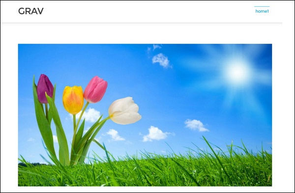
Description
Using media queries in your attributes, you can use different widths on devices. In this process, you dont have to create multiple images as they get created automatically. If your browser does not support src set, then it displays the original image.
Example

Output
The above code will generate the following output −
grav_media.htm
Advertisements