
 Data Structure
 Networking
 RDBMS
RDBMS Operating System
 Java
Java MS Excel
 iOS
iOS HTML
HTML CSS
CSS Android
 Python
 C Programming
 C++
C++ C#
C# MongoDB
 MySQL
MySQL Javascript
 PHP
PHP
- Selected Reading
- UPSC IAS Exams Notes
- Developer's Best Practices
- Questions and Answers
- Effective Resume Writing
- HR Interview Questions
- Computer Glossary
- Who is Who
Graph Plotting in Python
Python has the ability to create graphs by using the matplotlib library. It has numerous packages and functions which generate a wide variety of graphs and plots. It is also very simple to use. It along with numpy and other python built-in functions achieves the goal. In this article we will see some of the different kinds of graphs it can generate.
Simple Graphs
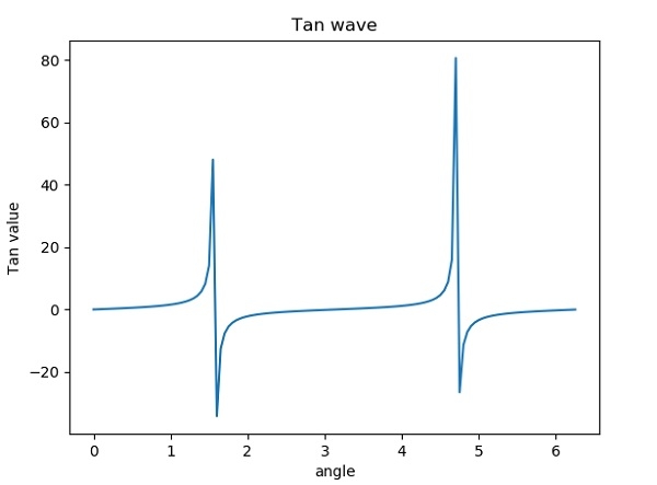
Here we take a mathematical function to generate the x and Y coordinates of the graph. Then we use matplotlib to plot the graph for that function. Here we can apply labels and show the title of the graph as shown below. We are plotting the graph for the trigonometric function − tan.
Example
from matplotlib import pyplot as plt
import numpy as np
import math #needed for definition of pi
x = np.arange(0, math.pi*2, 0.05)
y = np.tan(x)
plt.plot(x,y)
plt.xlabel("angle")
plt.ylabel("Tan value")
plt.title('Tan wave')
plt.show()
Output
Running the above code gives us the following result −
Multiplots
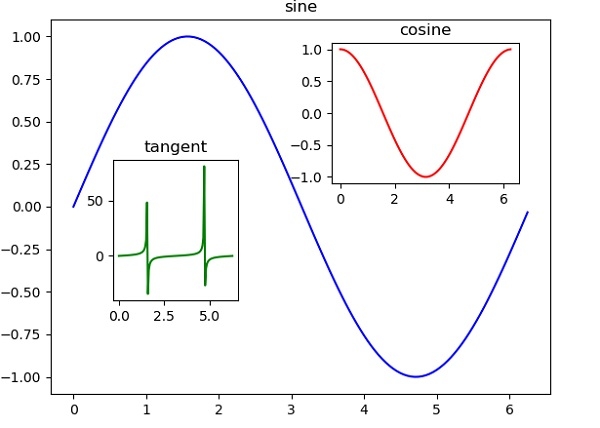
We can have two or more plots on a single canvas by creating multiple axes and using them in the program.
Example
import matplotlib.pyplot as plt
import numpy as np
import math
x = np.arange(0, math.pi*2, 0.05)
fig=plt.figure()
axes1 = fig.add_axes([0.1, 0.1, 0.8, 0.8]) # main axes
axes2 = fig.add_axes([0.55, 0.55, 0.3, 0.3]) # inset axes
axes3 = fig.add_axes([0.2, 0.3, 0.2, 0.3]) # inset axes
axes1.plot(x, np.sin(x), 'b')
axes2.plot(x,np.cos(x),'r')
axes3.plot(x,np.tan(x),'g')
axes1.set_title('sine')
axes2.set_title("cosine")
axes3.set_title("tangent")
plt.show()
Output
Running the above code gives us the following result −
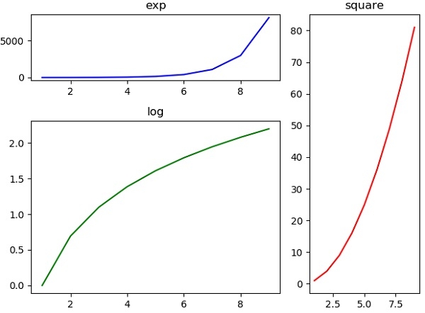
Grid of Subplots
We can also create a grid containing different graphs each of which is a subplot. For this we use the function subplot2grid. Here we have to choose the axes carefully so that all the subplots can fit in to the grid. A little hit an dtrail may be needed.
Example
import matplotlib.pyplot as plt
a1 = plt.subplot2grid((3,3),(0,0),colspan = 2)
a2 = plt.subplot2grid((3,3),(0,2), rowspan = 3)
a3 = plt.subplot2grid((3,3),(1,0),rowspan = 2, colspan = 2)
import numpy as np
x = np.arange(1,10)
a2.plot(x, x*x,'r')
a2.set_title('square')
a1.plot(x, np.exp(x),'b')
a1.set_title('exp')
a3.plot(x, np.log(x),'g')
a3.set_title('log')
plt.tight_layout()
plt.show()
Output
Running the above code gives us the following result:
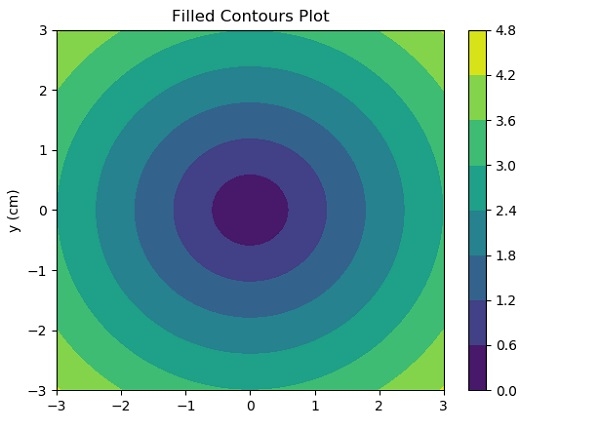
Contour Plot
Contour plots (sometimes called Level Plots) are a way to show a three-dimensional surface on a two-dimensional plane. It graphs two predictor variables X Y on the y-axis and a response variable Z as contours.Matplotlib contains contour() and contourf() functions that draw contour lines and filled contours, respectively.
Example
import numpy as np
import matplotlib.pyplot as plt

xlist = np.linspace(-3.0, 3.0, 100)
ylist = np.linspace(-3.0, 3.0, 100)

X, Y = np.meshgrid(xlist, ylist)
Z = np.sqrt(X**2 + Y**2)

fig,ax=plt.subplots(1,1)
cp = ax.contourf(X, Y, Z)
fig.colorbar(cp) # Add a colorbar to a plot
ax.set_title('Filled Contours Plot')

#ax.set_xlabel('x (cm)')
ax.set_ylabel('y (cm)')
plt.show()
Output
Running the above code gives us the following result:

1K+ Views
