
 Data Structure
 Networking
 RDBMS
RDBMS Operating System
 Java
Java MS Excel
 iOS
iOS HTML
HTML CSS
CSS Android
 Python
 C Programming
 C++
C++ C#
C# MongoDB
 MySQL
MySQL Javascript
 PHP
PHP
- Selected Reading
- UPSC IAS Exams Notes
- Developer's Best Practices
- Questions and Answers
- Effective Resume Writing
- HR Interview Questions
- Computer Glossary
- Who is Who
Frequency plot in Python/Pandas DataFrame using Matplotlib
To show a frequency plot in Python/Pandas dataframe using Matplotlib, we can take the following steps −
- Set the figure size and adjust the padding between and around the subplots.
- Create a figure and a set of subplots.
- Make a two-dimensional, size-mutable, potentially heterogeneous tabular data.
- Return a Series containing the counts of unique values.
- To display the figure, use show() method.
Example
import pandas as pd
from matplotlib import pyplot as plt
plt.rcParams["figure.figsize"] = [7.50, 3.50]
plt.rcParams["figure.autolayout"] = True
fig, ax = plt.subplots()
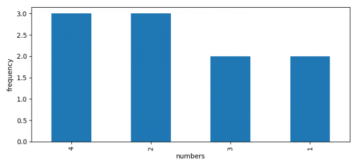
df = pd.DataFrame({'numbers': [2, 4, 1, 4, 3, 2, 1, 3, 2, 4]})
df['numbers'].value_counts().plot(ax=ax, kind='bar', xlabel='numbers', ylabel='frequency')
plt.show()
Output

Updated on: 2021-06-10T12:00:11+05:30
16K+ Views

Advertisements