
 Data Structure
 Networking
 RDBMS
RDBMS Operating System
 Java
Java MS Excel
 iOS
iOS HTML
HTML CSS
CSS Android
 Python
 C Programming
 C++
C++ C#
C# MongoDB
 MySQL
MySQL Javascript
 PHP
PHP
- Selected Reading
- UPSC IAS Exams Notes
- Developer's Best Practices
- Questions and Answers
- Effective Resume Writing
- HR Interview Questions
- Computer Glossary
- Who is Who
Donut Chart in Pygal
Pygal is a Python library that is used for creating graphs and charts for data visualization. The donut chart is a type of pie chart with a hole in the middle. Donut chat can be easily created using the Pygal library. In this article, we will visualize sample data using a Donut chart.
Installing Pygal library
Before we start using the Pygal module, we need to install the Pygal library in our system by using the Python package manager. Type the following command in your terminal or command prompt to install the Pygal library.
pip install pygal
Algorithm
Import the Pygal module.
Create a Donut chart using the Pie() function and specify an inner radius if desired.
Add data to the Donut chart using the add() method and provide a label and data points for each series.
Customize the chart by setting attributes such as the chart title, font sizes, and custom colors and hover effects using the style parameter.
Render the chart to a file or display it in the output using the appropriate method (render_to_file() or render_in_browser()).
Creating a Donut chart
After installing Pygal we can use the Pygal functionalities to create a Donut chart of any data in Python.
Example
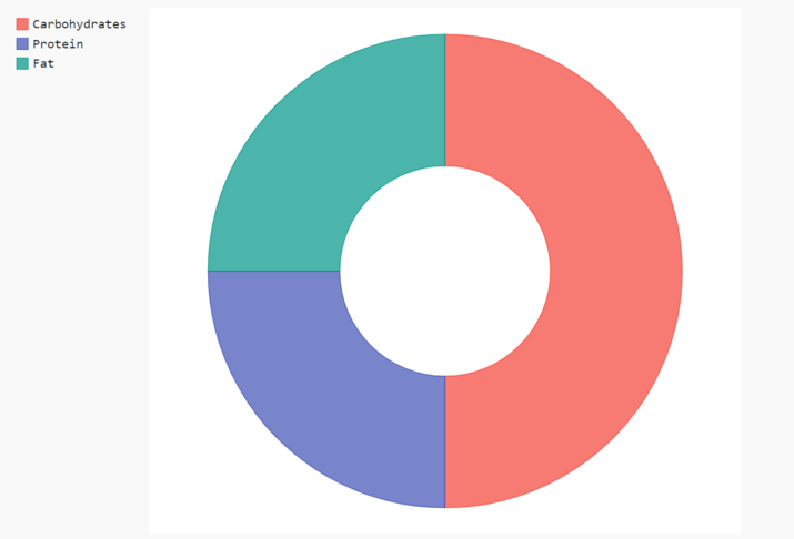
In the below example, we are creating a Donut chart for the percentage of calories that come from different macronutrients in a person's diet. We use the pygal.Pie() function to set the inner radius to 0.4 using the inner_radius parameter. The inner radius is the size of the hole in the middle of the chart.
import pygal

# Create a Donut chart
donut_chart = pygal.Pie(inner_radius=0.4)

# Add data to the Donut chart
donut_chart.add('Carbohydrates', 50)
donut_chart.add('Protein', 25)
donut_chart.add('Fat', 25)

# Render the chart
donut_chart.render_to_file('donut_chart.svg')
Output
Customizing the Donut Chart
We can customize our donut chart using Pygal in different ways like changing the color of the chart, adding a title and label, changing font size, etc.
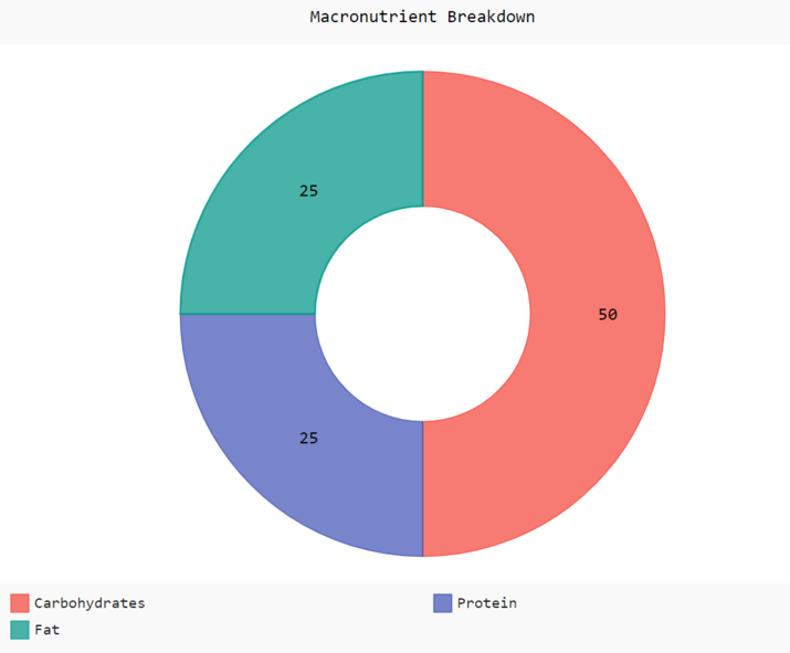
Example
In the below example, we will add titles and labels and also add custom colors to our chart. We can pass a custom color to each data point using the color parameter. With the help of the title parameter, we can add the title to the chart.
import pygal

# Create a Donut chart
donut_chart = pygal.Pie(inner_radius=0.4)

# Add data to the Donut chart
donut_chart.add('Carbohydrates', 50, color='rgb(31, 119, 180)')
donut_chart.add('Protein', 25, color='rgb(255, 127, 14)')
donut_chart.add('Fat', 25, color='rgb(44, 160, 44)')

# Customize the Donut chart
donut_chart.title = 'Macronutrient Breakdown'
donut_chart.legend_at_bottom = True
donut_chart.legend_box_size = 16
donut_chart.print_values = True
donut_chart.value_font_size = 20
donut_chart.label_font_size = 18

# Render the chart
donut_chart.render_to_file('donut_chart.svg')
Output
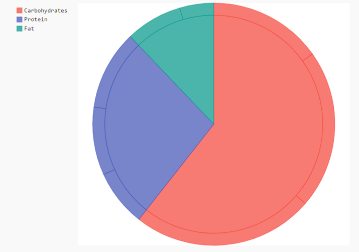
Creating a Donut chart with Multiple Series
To create a Donut chart with multiple series, we can use the add() method multiple times with different data points and labels.
Example
In the code above, we first create a Donut chart with an inner radius of 0.4. We then add multiple series to the chart using the add() method. Each series has its own set of data points and labels. Finally, we render the chart to a file using the render_to_file() method.
import pygal

# Create a Donut chart with multiple series
donut_chart = pygal.Pie(inner_radius=0.4)

# Add data to the Donut chart
donut_chart.add('Carbohydrates', [50, 70, 80])
donut_chart.add('Protein', [25, 30, 35])
donut_chart.add('Fat', [25, 0, 15])

# Render the chart to a file
donut_chart.render_to_file('multiple_series_donut_chart.svg')
Customizing a Donut chart with Color and Hover Effects
We can also customize a Donut chart by changing its colors and showing hover effects. Pygal provides several customization options for Donut charts, including the style parameter, which allows us to define custom colors and other style attributes.
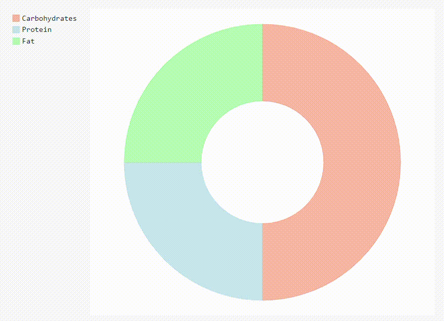
Example
In the code below, we first create a Donut chart with an inner radius of 0.4 and a custom style using the style parameter. The colors attribute of the style parameter allows us to define custom colors for each series. We also set the hover_fill attribute to define the color of the hover effect, and the hover_font_size, value_font_size, and label_font_size attributes to set the font sizes of various elements in the chart. We then add data to the chart using the add() method, just like in the previous example. Finally, we render the chart to a file using the render_to_file() method.
import pygal

# Create a Donut chart with custom colors and hover effects
donut_chart = pygal.Pie(inner_radius=0.4, style=pygal.style.Style(
   colors=('#FFA07A', '#ADD8E6', '#90EE90'),
   hover_fill='#FFF',
   hover_font_size=20,
   value_font_size=25,
   label_font_size=25
))

# Add data to the Donut chart
donut_chart.add('Carbohydrates', 50)
donut_chart.add('Protein', 25)
donut_chart.add('Fat', 25)

# Render the chart to a file
donut_chart.render_to_file('customized_donut_chart.svg')
Output
Conclusion
In this article, we have discussed the Pygal library and how we can draw donut charts using the Pygal library in Python. Pygal provides various functions to visualize data in form of charts. We have only used the donut charts in this article but we can use draw other charts also using Pygal library.

212 Views
