
 Data Structure
 Networking
 RDBMS
RDBMS Operating System
 Java
Java MS Excel
 iOS
iOS HTML
HTML CSS
CSS Android
 Python
 C Programming
 C++
C++ C#
C# MongoDB
 MySQL
MySQL Javascript
 PHP
PHP
- Selected Reading
- UPSC IAS Exams Notes
- Developer's Best Practices
- Questions and Answers
- Effective Resume Writing
- HR Interview Questions
- Computer Glossary
- Who is Who
Creating colored lines based on length with Tkinter
Data visualization is an essential tool for understanding and interpreting complex information. When working with graphical representations, it is often useful to assign colors to objects based on their characteristics. In this article, we will explore how to create colored lines in Tkinter, Python's standard GUI toolkit, based on their length. By assigning different colors to lines of varying lengths, we can enhance the visual representation of data and facilitate easier data interpretation.
Understanding the Concept
Before diving into the implementation, let's understand the concept of creating colored lines based on their length. The basic idea is to associate a specific color with each line, where the color is determined by the length of the line. This technique is particularly useful when dealing with data that has a numerical dimension related to line length. For example, you may have a dataset where each data point represents a line segment, and the associated value represents its length. By mapping different colors to different length ranges, you can create a visual representation that emphasizes variations in line length.
Step 1: Set Up the Tkinter Environment
To begin, make sure you have Tkinter installed, as it comes bundled with most Python distributions. Once installed, import the necessary modules and create the main Tkinter window where the visualization will be displayed.
import tkinter as tk

# Create the main window
window = tk.Tk()
window.geometry("720x250")
window.title("Colored Lines based on Length")

# Set the dimensions of the canvas
canvas_width = 800
canvas_height = 400

# Create the canvas
canvas = tk.Canvas(window, width=canvas_width, height=canvas_height)
canvas.pack()
Step 2: Prepare the Data
Next, we need to prepare the data containing the line segments and their associated lengths. For demonstration purposes, let's assume we have a list of tuples, where each tuple contains the starting and ending points of a line segment, as well as its length.
# Sample data (x1, y1, x2, y2, length)
data = [
   (100, 100, 300, 100, 200),
   (100, 200, 400, 200, 300),
   (100, 300, 600, 300, 500),
   (100, 400, 800, 400, 700),
   # Add more data points as needed
]
In this example, we have four line segments, each defined by the coordinates of its starting and ending points, along with the corresponding length.
Step 3: Define Color Mapping
To assign colors based on the length of each line segment, we need to define a color mapping scheme. This can be accomplished using a range of techniques, such as linear mapping, color interpolation, or discrete color categories. For simplicity, let's define a linear color mapping scheme, where shorter lines are assigned lighter colors, and longer lines are assigned darker colors.
# Define color mapping
color_min = "#FFCCCC"  # Light color for minimum length
color_max = "#FF0000"  # Dark color for maximum length

def map_color(length):
   """
   Map line length to a color within the defined range
   """
   normalized_length = (length - min_length) / (max_length - min_length)
   red = int((1 - normalized_length) * int(color_min[1:3], 16) + normalized_length * int(color_max[1:3], 16))
   green = int((1 - normalized_length) * int(color_min[3:5], 16) + normalized_length * int(color_max[3:5], 16))
   blue = int((1 - normalized_length) * int(color_min[5:7], 16) + normalized_length * int(color_max[5:7], 16))
   color = f"#{red:02x}{green:02x}{blue:02x}"
   return color

# Find the minimum and maximum length in the data
min_length = min(data, key=lambda x: x[4])[4]
max_length = max(data, key=lambda x: x[4])[4]
Step 4: Plot the Colored Lines
Now that we have the canvas, data, and color mapping defined, we can proceed to plot the colored lines based on their lengths.
for line in data:
   x1, y1, x2, y2, length = line
   color = map_color(length)
   canvas.create_line(x1, y1, x2, y2, fill=color)
Step 5: Display the Visualization
To display the visualization, we need to start the Tkinter event loop.
window.mainloop()
Example
import tkinter as tk

window = tk.Tk()
window.geometry("720x250")
window.title("Colored Lines based on Length")

canvas_width = 800
canvas_height = 400

canvas = tk.Canvas(window, width=canvas_width, height=canvas_height)
canvas.pack()

data = [
   (100, 100, 300, 100, 200),
   (100, 200, 400, 200, 300),
   (100, 300, 600, 300, 500),
   (100, 400, 800, 400, 700),
]

color_min = "#FFCCCC"
color_max = "#FF0000"

def map_color(length):
   normalized_length = (length - min_length) / (max_length - min_length)
   red = int((1 - normalized_length) * int(color_min[1:3], 16) + normalized_length * int(color_max[1:3], 16))
   green = int((1 - normalized_length) * int(color_min[3:5], 16) + normalized_length * int(color_max[3:5], 16))
   blue = int((1 - normalized_length) * int(color_min[5:7], 16) + normalized_length * int(color_max[5:7], 16))
   color = f"#{red:02x}{green:02x}{blue:02x}"
   return color

min_length = min(data, key=lambda x: x[4])[4]
max_length = max(data, key=lambda x: x[4])[4]

for line in data:
   x1, y1, x2, y2, length = line
   color = map_color(length)
   canvas.create_line(x1, y1, x2, y2, fill=color)

window.mainloop()
This complete implementation example incorporates all the steps outlined in the article. It creates a Tkinter window, defines the canvas dimensions, prepares the data, maps colors based on line lengths, and plots the colored lines on the canvas.
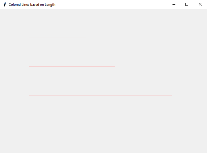
Output
By running this example, you will be able to visualize colored lines where the color represents the length of each line segment. You can customize the colors, data, and canvas dimensions to suit your specific requirements and explore further enhancements to the visualization.
Conclusion
In conclusion, creating colored lines based on length can significantly enhance the visual representation of data. Tkinter provides a flexible and powerful framework for implementing such visualizations in Python. By following the step-by-step guide and utilizing the provided implementation example, you can easily create dynamic and informative data visualizations using Tkinter.

347 Views
