
 Data Structure
 Networking
 RDBMS
RDBMS Operating System
 Java
Java MS Excel
 iOS
iOS HTML
HTML CSS
CSS Android
 Python
 C Programming
 C++
C++ C#
C# MongoDB
 MySQL
MySQL Javascript
 PHP
PHP
- Selected Reading
- UPSC IAS Exams Notes
- Developer's Best Practices
- Questions and Answers
- Effective Resume Writing
- HR Interview Questions
- Computer Glossary
- Who is Who
Create a Point plot with SeaBorn – Python Pandas
The seaborn.pointplot() is used to create a point plot. Let’s say the following is our dataset in the form of a CSV file − Cricketers.csv
At first, import the required 3 libraries −
import seaborn as sb
import pandas as pd
import matplotlib.pyplot as plt
Load data from a CSV file into a Pandas DataFrame −
dataFrame = pd.read_csv("C:\Users\amit_\Desktop\Cricketers.csv")
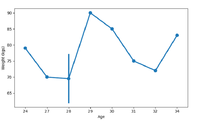
Plotting point plot with Age and Weight column −
sb.pointplot(x =dataFrame["Age"], y = dataFrame["Weight"], data = dataFrame)
Example
Following is the code −
import seaborn as sb
import pandas as pd
import matplotlib.pyplot as plt

# Load data from a CSV file into a Pandas DataFrame
dataFrame = pd.read_csv("C:\Users\amit_\Desktop\Cricketers.csv")

# plotting point plot with Age and Weight column
sb.pointplot(x =dataFrame["Age"], y = dataFrame["Weight"], data = dataFrame)

# label
plt.ylabel("Weight (kgs)")

# display
plt.show()
Output
This will produce the following output −
Example
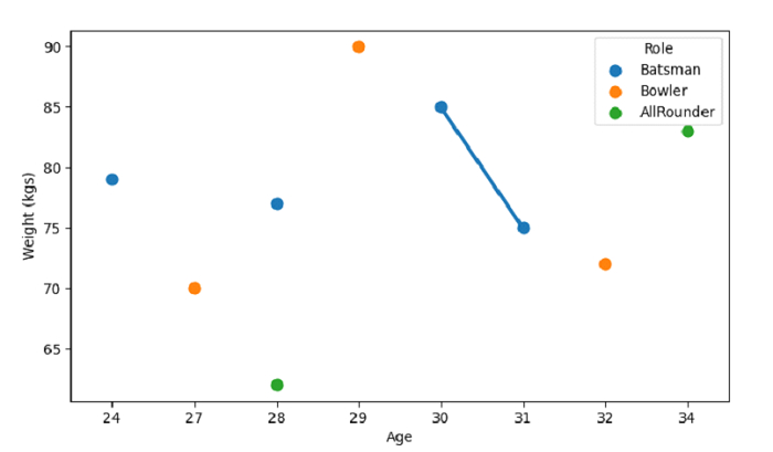
Let us see another example wherein we have set the hue parameter −
import seaborn as sb
import pandas as pd
import matplotlib.pyplot as plt

# Load data from a CSV file into a Pandas DataFrame
dataFrame = pd.read_csv("C:\Users\amit_\Desktop\Cricketers.csv")

# plotting point plot with Age and Weight column
# we have set the hue parameter as Role columns
sb.pointplot(dataFrame['Age'],dataFrame['Weight'], hue=dataFrame['Role'])

# label
plt.ylabel("Weight (kgs)")

# display
plt.show()
Output
This will produce the following output −

Updated on: 2021-10-01T12:33:51+05:30
382 Views

Advertisements