
 Data Structure
 Networking
 RDBMS
RDBMS Operating System
 Java
Java MS Excel
 iOS
iOS HTML
HTML CSS
CSS Android
 Python
 C Programming
 C++
C++ C#
C# MongoDB
 MySQL
MySQL Javascript
 PHP
PHP
- Selected Reading
- UPSC IAS Exams Notes
- Developer's Best Practices
- Questions and Answers
- Effective Resume Writing
- HR Interview Questions
- Computer Glossary
- Who is Who
Containers in Bootstrap with examples(3)
As the name suggests, a container is used to hold or bind something likewise containers in bootstrap are used for storing or binding the content over a viewport. Containers add padding to the content by providing it margin from all the four sides of a viewport and it can also be altered depending upon the needs. Containers can also be nested inside one another.
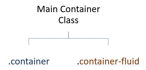
Now, let us understand each of the class in detail
container
In bootstrap, the .container class creates a responsive container with a fixed width in a viewport.It sets the max-width of a container depending upon the size of a viewport.
Given below is the chart describing the max-width of a .container class depending upon the size of a viewport.
| Extra Small | Small | Medium | Large | Extra Large | |
| max-width | 100% | 540px | 720px | 960px | 1140px |
Example
Let’s take an example to understand it better
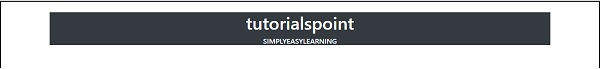
<html>
<head>
<title>.Container Class</title>
<meta charset="utf-8">
<meta name="viewport" content="width=device-width, initial-scale=1">
<link rel="stylesheet" href="https://maxcdn.bootstrapcdn.com/bootstrap/4.4.1/css/bootstrap.min.css">
<script src="https://ajax.googleapis.com/ajax/libs/jquery/3.5.1/jquery.min.js"></script>
<script src="https://cdnjs.cloudflare.com/ajax/libs/popper.js/1.16.0/umd/popper.min.js"></script>
<script src="https://maxcdn.bootstrapcdn.com/bootstrap/4.4.1/js/bootstrap.min.js"></script>
</head>
<body style="border:5px solid Black;">
<br>
<div class="container bg-dark text-white" style>
<center>
<h1>tutorialspoint</h1>
<h6>SIMPLYEASYLEARNING</h6>
</center>
</div>
</body>
</html>
Output
Output for this code will be
container-fluid
In bootstrap, the .container-fluid class creates a responsive container with a fixed width of 100% in a viewport. It sets the max-width of a container to 100% irrespective of the size of a viewport.
Given below is the chart describing the max-width of a .container-fluid class.
| Extra Small | Small | Medium | Large | Extra Large | |
| max-width | 100% | 100% | 100% | 100% | 100% |
Example
Let’s take an example to understand it better
<html>
<head>
<title>.Container Class</title>
<meta charset="utf-8">
<meta name="viewport" content="width=device-width, initial-scale=1">
<link rel="stylesheet" href="https://maxcdn.bootstrapcdn.com/bootstrap/4.4.1/css/bootstrap.min.css">
<script src="https://ajax.googleapis.com/ajax/libs/jquery/3.5.1/jquery.min.js"></script>
<script src="https://cdnjs.cloudflare.com/ajax/libs/popper.js/1.16.0/umd/popper.min.js"></script>
<script src="https://maxcdn.bootstrapcdn.com/bootstrap/4.4.1/js/bootstrap.min.js"></script>
</head>
<body style="border:5px solid Black;">
<br>
<div class="container-fluid bg-dark text-white">
<center>
<h1>tutorialspoint</h1>
<h6>SIMPLYEASYLEARNING</h6>
</center>
</div>
</body>
</html>
Output
Output for this code will be


510 Views
