
Article Categories
- All Categories
-
 Data Structure
-
 Networking
-
 RDBMS
RDBMS
-
 Operating System
-
 Java
Java
-
 MS Excel
-
 iOS
iOS
-
 HTML
HTML
-
 CSS
CSS
-
 Android
-
 Python
-
 C Programming
-
 C++
C++
-
 C#
C#
-
 MongoDB
-
 MySQL
MySQL
-
 Javascript
-
 PHP
PHP
Change chart colour based on the value in Excel
Conditional formatting refers to the process by which you can show distinct value ranges as different colours in a chart. This may be something you wish to do when you insert a chart at times. Because the Excel feature only applies to cells and not charts, we can apply the concept of conditional formatting to column charts by combining different data series. This is because conditional formatting is only applicable to cells.
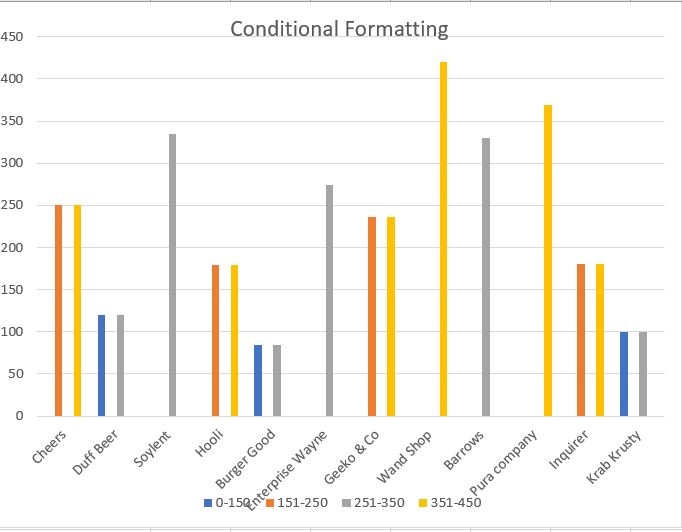
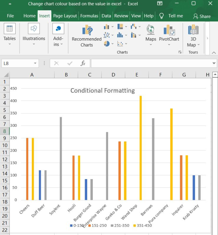
For instance, if the value range is 0-150, the series colour should be shown as blue. If the value range is 151-250, the colour should be shown as orange. If the value range is 251-350, the colour should be shown as grey. If the value range is 351-450, the colour should be shown as yellow.
Let?s take an example and understand how it works.
Step 1
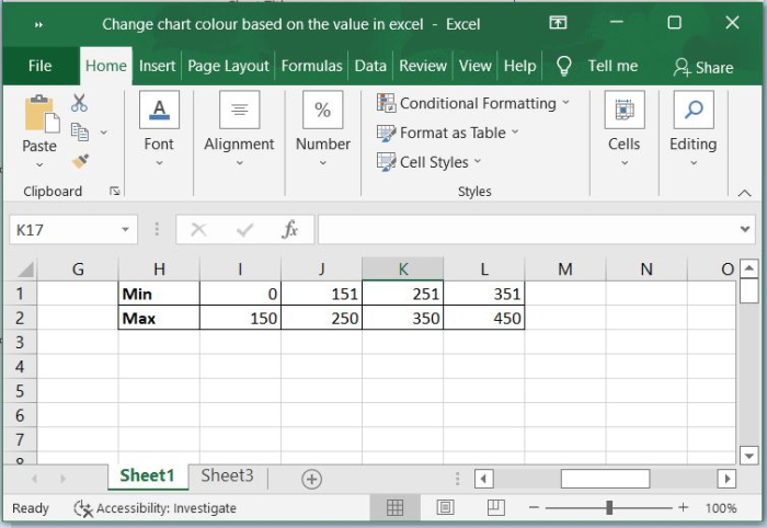
Determine the values of the boundaries.
The first thing you need to do when making a column chart using conditional formatting is to designate the segments that will be responsible for producing the various colours. In order to accomplish this, we can establish boundary values that act as dividers between the data values.
When specifying the values of the boundaries, it is important to consider whether or not you want the boundary value to be included in the bounds. In this particular illustration, I have delineated five sections by establishing two limits, which will account for both the lowest possible value and the highest possible value.
Step 2
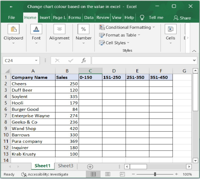
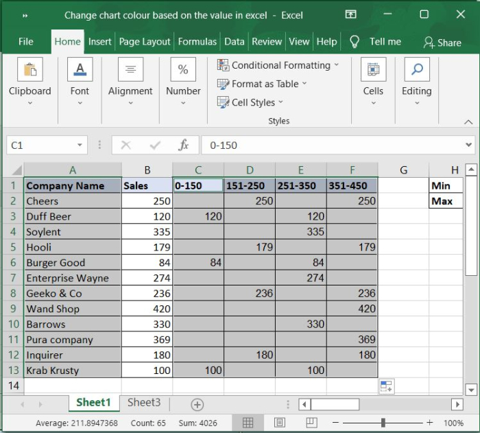
Create Source data.
Generate the data in the format indicated in the screenshot below, you should first list each value range, and then put the value ranges themselves as column headers next to the data.
Step 3
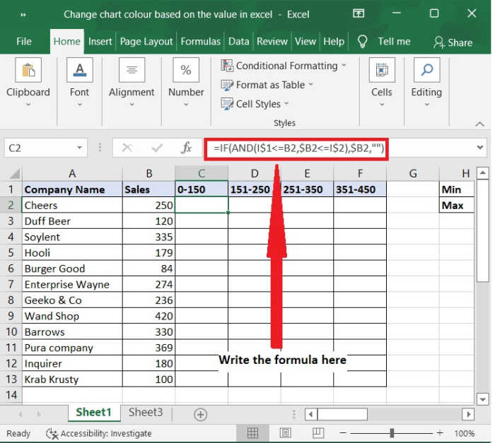
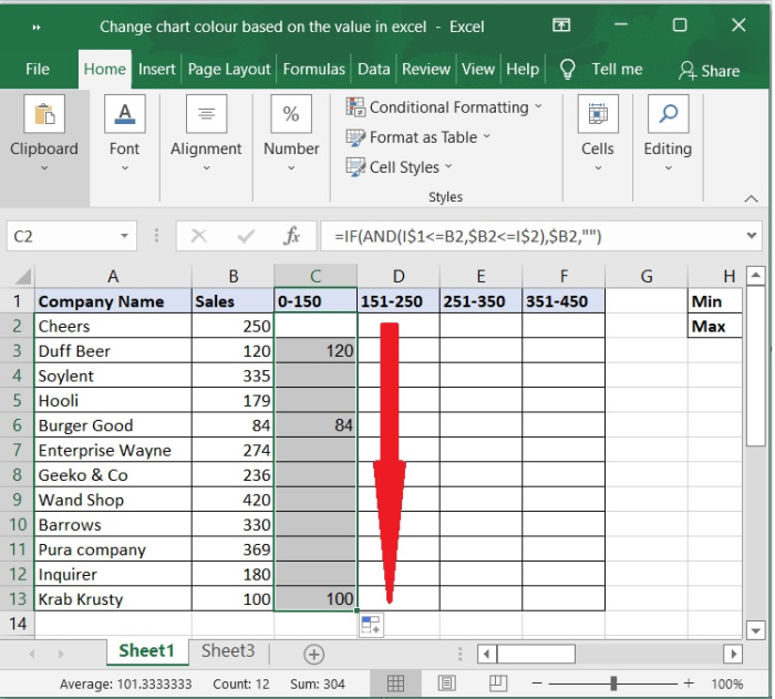
In C2 cell use the below formula ?
=IF(AND(L$1<=B3,$B3<=L$2),$B3,"")
Step 4
Then, drag the fill handle down to fill cells.
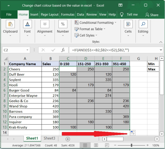
Step 5
Next, drag the handle right to fill cells.
Step 6
In the next step, select the Column Name, then hold down the Ctrl key and choose the formula cells with the value range headers included.
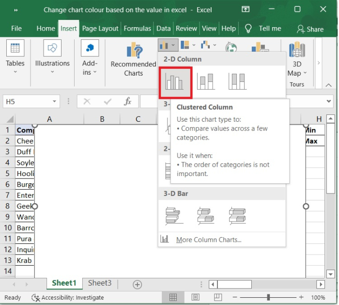
Step 7
Go to Insert tab - select clustered column chart type.
Step 8
Now, the chart will be created and the chart colours are different based on the values as shown in the below chart.
Conclusion
In this tutorial, we demonstrated how to change colours based on the value ranges. Excel has flexibility to define values of our own and we can format using the range of values.

12K+ Views
