
Article Categories
- All Categories
-
 Data Structure
-
 Networking
-
 RDBMS
RDBMS
-
 Operating System
-
 Java
Java
-
 MS Excel
-
 iOS
iOS
-
 HTML
HTML
-
 CSS
CSS
-
 Android
-
 Python
-
 C Programming
-
 C++
C++
-
 C#
C#
-
 MongoDB
-
 MySQL
MySQL
-
 Javascript
-
 PHP
PHP
Selected Reading
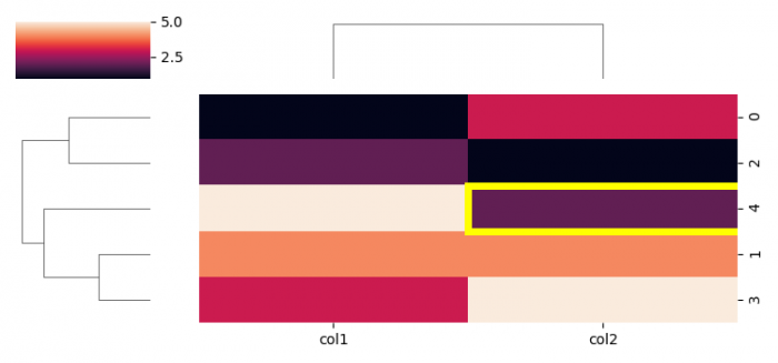
Add a custom border to certain cells in a Matplotlib / Seaborn plot
To add a custom border to certain cells in a Matplotlib/Seaborn plot.
Steps
- Set the figure size and adjust the padding between and around the subplots.
- Create a dataframe with some columns.
- Plot a matrix dataset as a hierarchically-clustered heatmap.
- Get heatmap axis as a subplot arrangement.
- To add a custom border to certain cells in Matplotlib, we can intialize a variable, border_color.
- Using custom bordder color, add a rectangle patch on the heatmap axes.
- To display the figure, use show() method.
Example
import pandas as pd
from matplotlib import pyplot as plt
import seaborn as sns
plt.rcParams["figure.figsize"] = [7.50, 3.50]
plt.rcParams["figure.autolayout"] = True
df = pd.DataFrame({"col1": [1, 4, 2, 3, 5], "col2": [3, 4, 1, 5, 2]})
g = sns.clustermap(df, figsize=(7.50, 3.50))
ax = g.ax_heatmap
border_color = "yellow"
ax.add_patch(plt.Rectangle((1, 2), 2, 1, fill=False,
edgecolor=border_color, lw=5))
plt.show()
Output

Updated on: 2021-06-01T11:35:48+05:30
1K+ Views

Advertisements