
 Data Structure
 Networking
 RDBMS
RDBMS Operating System
 Java
Java MS Excel
 iOS
iOS HTML
HTML CSS
CSS Android
 Python
 C Programming
 C++
C++ C#
C# MongoDB
 MySQL
MySQL Javascript
 PHP
PHP
- Selected Reading
- UPSC IAS Exams Notes
- Developer's Best Practices
- Questions and Answers
- Effective Resume Writing
- HR Interview Questions
- Computer Glossary
- Who is Who
Bootstrap 4 .flex-row-reverse class
Use the flex-row-reverse class in Bootstrap to reverse the order of flex items. It also aligns the flex items to the right.
Let us see the difference between the default arrangement of flex items and result of row-reverse class −
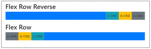
For reversing the order of rows, we have used the flex-row-reverse class like the following code snippet:
<div class="d-flex flex-row-reverse bg-primary mb-3">
The following is an example to implement the flex-row-reverse class −
Example
<!DOCTYPE html>
<html>
  <head>
    <title>Bootstrap Example</title>
    <meta charset="utf-8">
    <meta name="viewport" content="width=device-width, initial-scale=1">
    <link rel="stylesheet" href="https://maxcdn.bootstrapcdn.com/bootstrap/4.1.0/css/bootstrap.min.css">
    <script src="https://ajax.googleapis.com/ajax/libs/jquery/3.3.1/jquery.min.js"></script>
    <script src="https://maxcdn.bootstrapcdn.com/bootstrap/4.1.0/js/bootstrap.min.js"></script>
  </head>

<body>
  <div class="container mt-3">
    <h2>Flex</h2>
    <h2>Flex Row Reverse</h2>
    <div class="d-flex flex-row-reverse bg-primary mb-3">
      <div class="p-2 bg-secondary">A-ONE</div>
      <div class="p-2 bg-warning">B-ONE</div>
      <div class="p-2 bg-info">C-ONE</div>
    </div>
    <h2>Flex Row </h2>
      <div class="d-flex flex-row bg-primary mb-3">
      <div class="p-2 bg-secondary">A-ONE</div>
      <div class="p-2 bg-warning">B-ONE</div>
      <div class="p-2 bg-info">C-ONE</div>
  </div>
</div>
</body>
</html>

Updated on: 2020-06-15T19:21:47+05:30
1K+ Views

Advertisements