
Article Categories
- All Categories
-
 Data Structure
-
 Networking
-
 RDBMS
RDBMS
-
 Operating System
-
 Java
Java
-
 MS Excel
-
 iOS
iOS
-
 HTML
HTML
-
 CSS
CSS
-
 Android
-
 Python
-
 C Programming
-
 C++
C++
-
 C#
C#
-
 MongoDB
-
 MySQL
MySQL
-
 Javascript
-
 PHP
PHP
Selected Reading
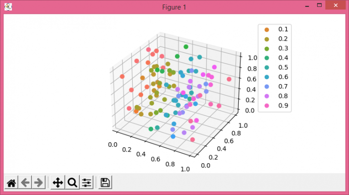
3D scatterplots in Python Matplotlib with hue colormap and legend
To plot 3D scatter plots in Python with hue colormap and legend, we can take the following steps−
- Set the figure size and adjust the padding between and around the subplots
- Create x, y and z data points using numpy.
- Create a new figure or activate an existing figure using figure() method.
- Get the current axes, creating one if necessary.
- Get the hue colormap, defining a palette.
- Plot x, y and z data points using scatter() method.
- Place a legend on the plot.
- To display the figure, use show() method.
Example
import numpy as np
import seaborn as sns
from matplotlib import pyplot as plt
from matplotlib.colors import ListedColormap

plt.rcParams["figure.figsize"] = [7.50, 3.50]
plt.rcParams["figure.autolayout"] = True

x = np.random.rand(100)
y = np.random.rand(100)
z = np.random.rand(100)

fig = plt.figure()
ax = fig.gca(projection='3d')
cmap = ListedColormap(sns.color_palette("husl", 256).as_hex())
sc = ax.scatter(x, y, z, s=40, c=x, marker='o', cmap=cmap, alpha=1)
plt.legend(*sc.legend_elements(), bbox_to_anchor=(1.05, 1), loc=2)

plt.show()
Output

Updated on: 2021-06-05T08:26:03+05:30
3K+ Views

Advertisements