- Flex - Home
- Flex - Overview
- Flex - Environment
- Flex - Applications
- Flex - Create Application
- Flex - Deploy Application
- Flex - Life Cycle Phases
- Flex - Style with CSS
- Flex - Style with Skin
- Flex - Data Binding
- Flex - Basic Controls
- Flex - Form Controls
- Flex - Complex Controls
- Flex - Layout Panels
- Flex - Visual Effects
- Flex - Event Handling
- Flex - Custom Controls
- Flex - RPC Services
- Flex - FlexUnit Integration
- Flex - Debug Application
- Flex - Internationalization
- Flex - Printing Support
Flex - ComboBox Control
When the user selects an item from the drop-down list in the ComboBox control, the data item appears in the prompt area of the control.
One difference between the ComboBox and DropDownList controls is that the prompt area of the ComboBox control is implemented by using the TextInput control, whereas in case of DropDownList control, it is Label control. Therefore, a user can edit the prompt area of the control to enter a value that is not one of the options available.
Class Declaration
Following is the declaration for spark.components.ComboBox class −
public class ComboBox
   extends DropDownListBase
      implements IIMESupport
Public Properties
| Sr.No | Property & Description |
|---|---|
| 1 | enableIME : Boolean [read-only] |
| 2 | imeMode : String |
| 3 | itemMatchingFunction : Function = null Specifies a callback function used to search the item list as the user enters characters into the prompt area. |
| 4 | labelToItemFunction : Function Specifies a callback function to convert a new value entered into the prompt area to the same data type as the data items in the data provider. |
| 5 | maxChars : int The maximum number of characters that the prompt area can contain, as entered by a user. |
| 6 | openOnInput : Boolean = true If true, the drop-down list opens when the user edits the prompt area. |
| 7 | prompt : String Text to be displayed if/when the input text is null. |
| 8 | restrict : String Specifies the set of characters that a user can enter into the prompt area. |
Public Methods
| Sr.No | Method & Description |
|---|---|
| 1 | ComboBox() Constructor. |
Methods Inherited
This class inherits methods from the following classes −
- spark.components.supportClasses.DropDownListBase
- spark.components.List
- spark.components.supportClasses.ListBase
- spark.components.SkinnableDataContainer
- spark.components.supportClasses.SkinnableContainerBase
- spark.components.supportClasses.SkinnableComponent
- mx.core.UIComponent
- mx.core.FlexSprite
- flash.display.Sprite
- flash.display.DisplayObjectContainer
- flash.display.InteractiveObject
- flash.display.DisplayObject
- flash.events.EventDispatcher
- Object
Flex ComboBox Control Example
Let us follow the following steps to check usage of ComboBox control in a Flex application by creating a test application −
| Step | Description |
|---|---|
| 1 | Create a project with a name HelloWorld under a packagecom.tutorialspoint.client as explained in the Flex - Create Application chapter. |
| 2 | Modify HelloWorld.mxml as explained below. Keep rest of the files unchanged. |
| 3 | Compile and run the application to make sure business logic is working as per the requirements. |
Following is the content of the modified mxml file src/com.tutorialspoint/HelloWorld.mxml
<?xml version = "1.0" encoding = "utf-8"?>
<s:Application xmlns:fx = "http://ns.adobe.com/mxml/2009"
   xmlns:s = "library://ns.adobe.com/flex/spark"
   xmlns:mx = "library://ns.adobe.com/flex/mx"
   width = "100%" height = "100%" minWidth = "500" minHeight = "500">

   <fx:Style source = "/com/tutorialspoint/client/Style.css" />
   <fx:Script>
      <![CDATA[
         import mx.collections.ArrayCollection;

         [Bindable]
         public var data:ArrayCollection = new ArrayCollection (
         [
            {value:"France", code:"FR"},
            {value:"Japan", code:"JP"},
            {value:"India", code:"IN"},
            {value:"Russia", code:"RS"},
            {value:"United States", code:"US"}
         ]
         );

         private function mappingFunction(input:String):Object {
            switch (input){
               case "France":
                  return {value:input, code:"FR"};
               case "Japan":
                  return {value:input, code:"JP"};
               case "India":
                  return {value:input, code:"IN"};
               case "Russia":
                  return {value:input, code:"RS"};
               case "United States":
                  return {value:input, code:"US"};
            }
            return null;
         }

      ]]>
   </fx:Script>

   <fx:Declarations>
      <mx:DateFormatter id = "dateFormatter" />
   </fx:Declarations>

   <s:BorderContainer width = "550" height = "400" id = "mainContainer"
      styleName = "container">
      <s:VGroup width = "100%" height = "100%" gap = "50" horizontalAlign = "center"
         verticalAlign = "middle">
         <s:Label id = "lblHeader" text = "Form Controls Demonstration"
            fontSize = "40" color = "0x777777" styleName = "heading" />

         <s:Panel id = "comboBoxPanel" title = "Using ComboBox" width = "420"
            height = "200">
         <s:layout>
            <s:VerticalLayout  gap = "10" verticalAlign = "middle"
               horizontalAlign = "center" />
         </s:layout>

         <s:HGroup>
            <s:Label text = "Index :" /> <s:Label
               text = "{comboBox.selectedIndex}" fontWeight = "bold" />
            <s:Label text = "Value :" /> <s:Label
               text = "{comboBox.selectedItem.value}" fontWeight = "bold" />
            <s:Label text = "Code :" /> <s:Label
               text = "{comboBox.selectedItem.code}" fontWeight = "bold" />
         </s:HGroup>

         <s:ComboBox  id = "comboBox"  dataProvider = "{data}" width = "150"
            labelToItemFunction = "{mappingFunction}" selectedIndex = "0"
            labelField = "value" />
         </s:Panel>
      </s:VGroup>
   </s:BorderContainer>
</s:Application>
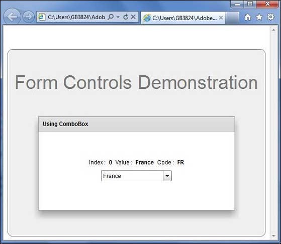
Once you are ready with all the changes done, let us compile and run the application in normal mode as we did in Flex - Create Application chapter. If everything is fine with your application, it will produce the following result: [ Try it online ]